This project was given to me by the Computer Literacy Center at Weber State University (WSU). For this project they wanted me to redesign their existing website so that it looked more appealing and user friendly for the students.
Old Home Page
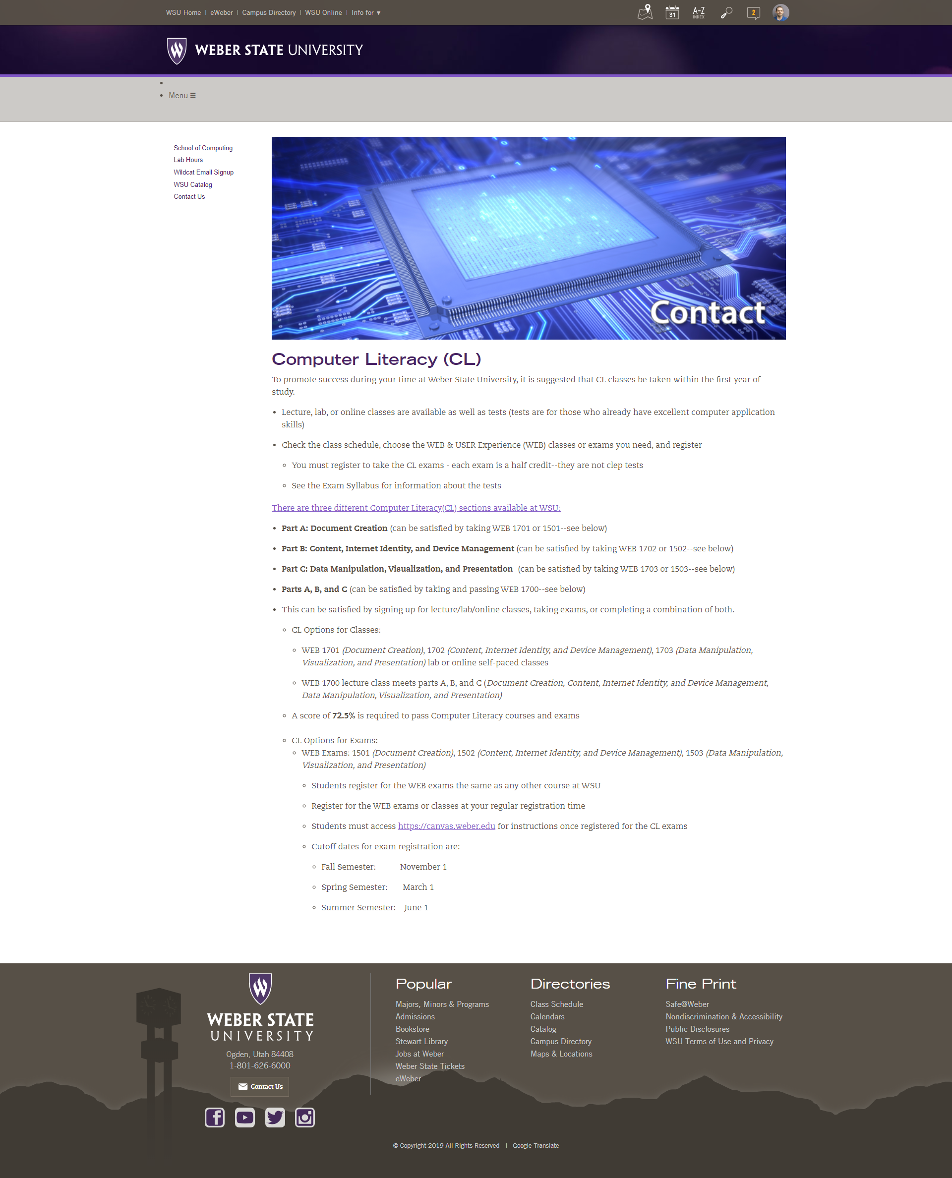
Old Classes Page
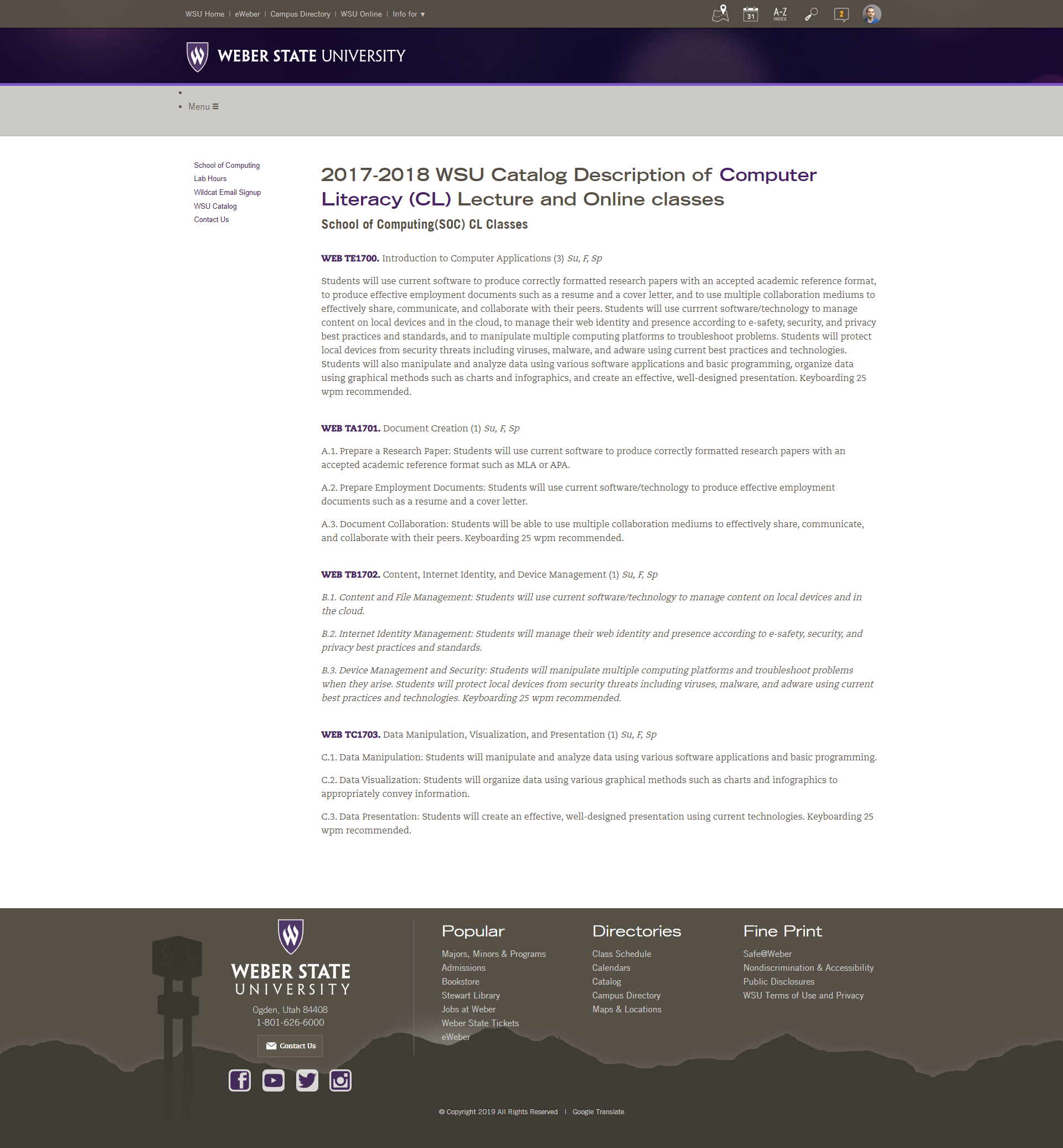
Old Classes Page
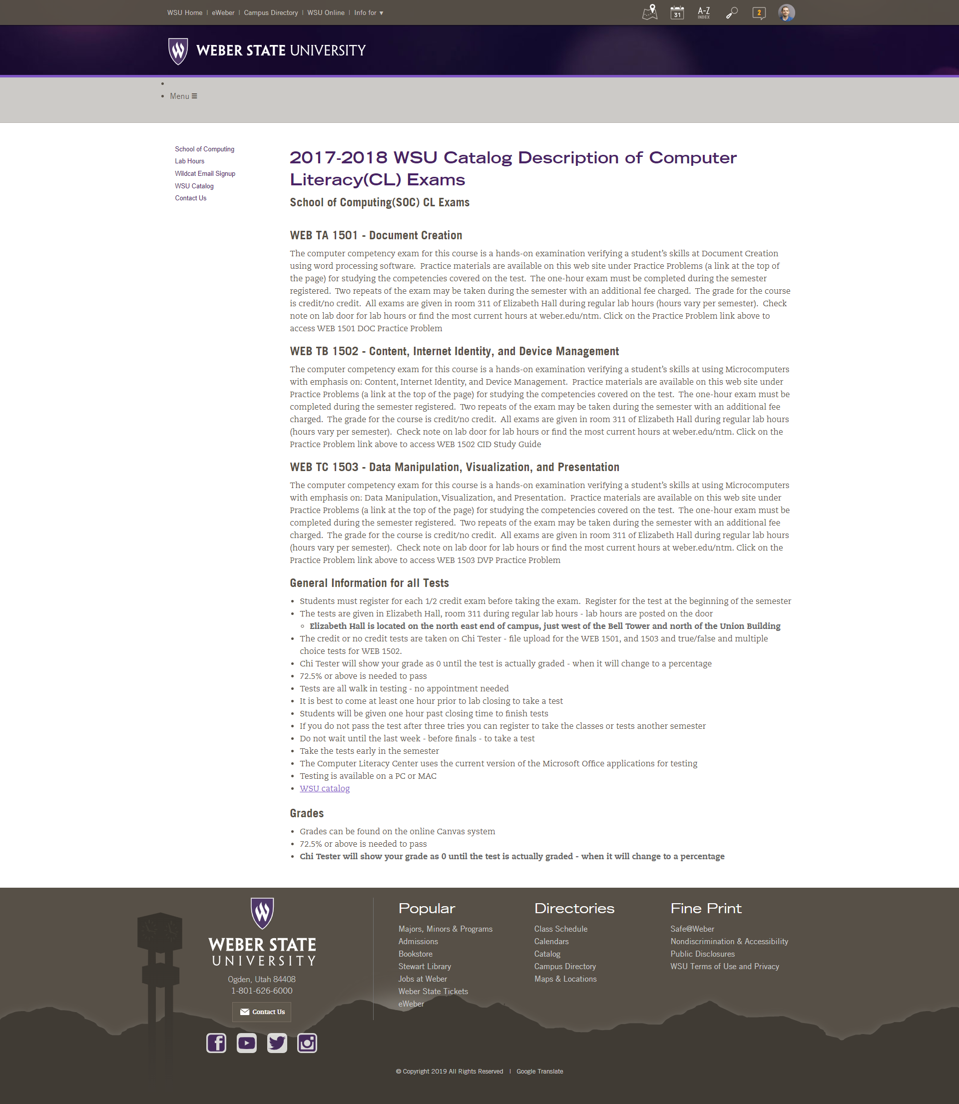
Old Classes Page
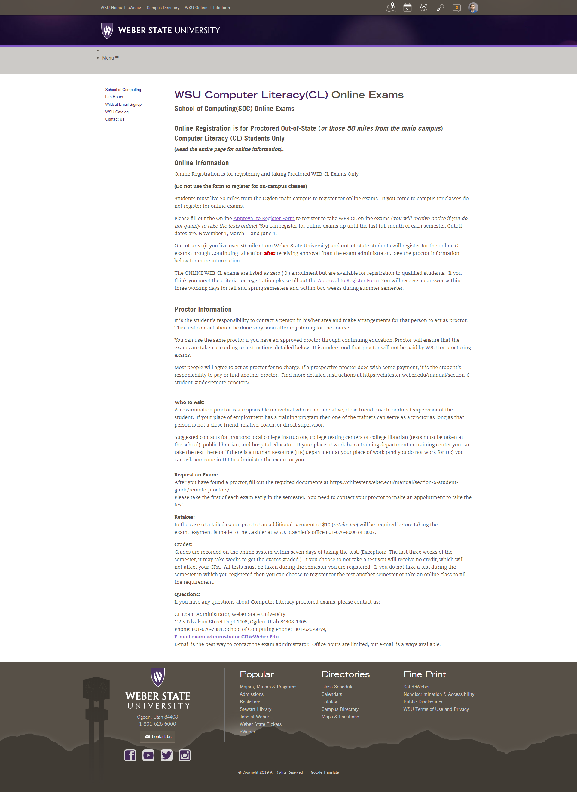
Old Classes Page
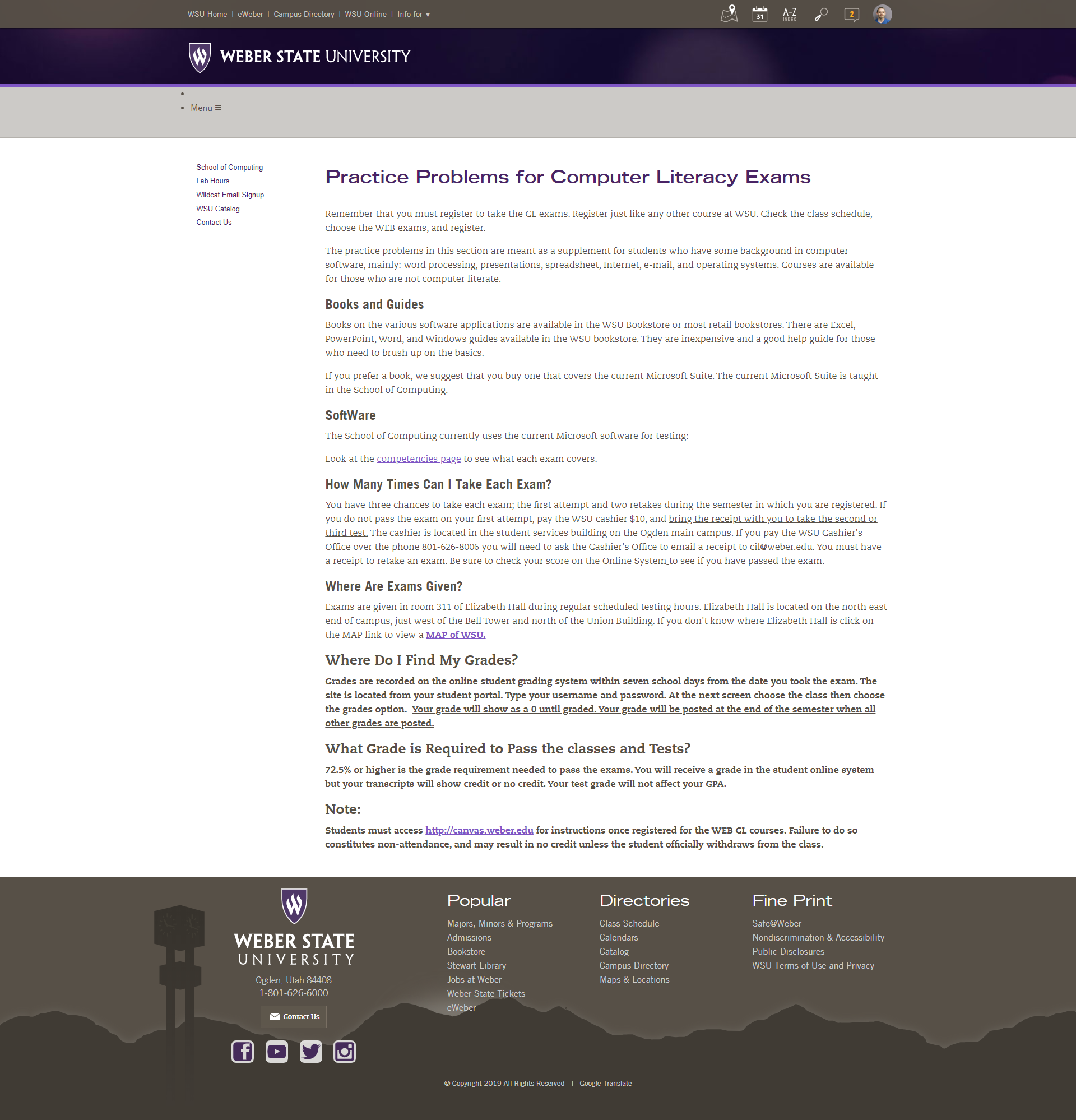
Old Classes Page

Old Classes Page
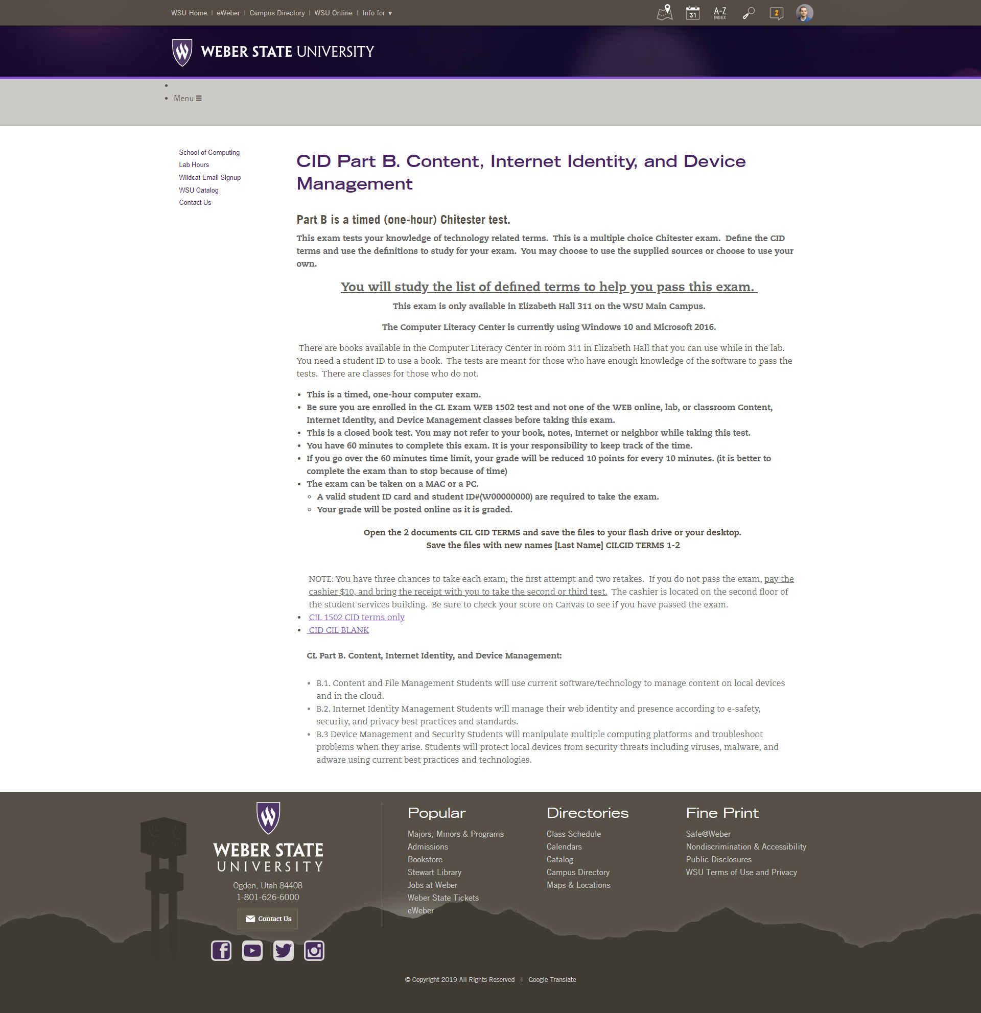
Old Classes Page
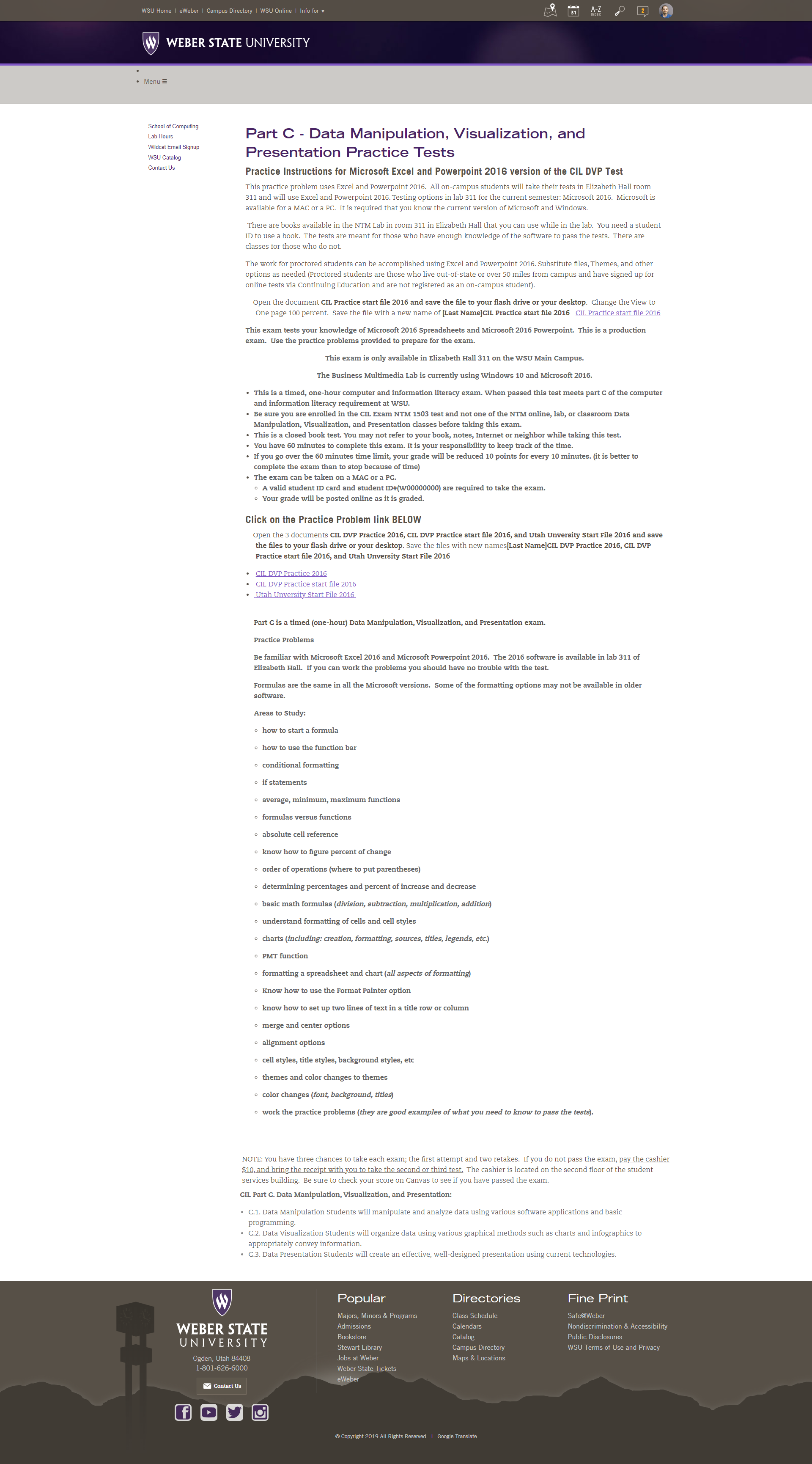
After getting an understanding of what the project was, my next step was to gather the information that was needed for this website. This information was all on the the existing website. After briefly reviewing the information I reiterated the project objectives with the stakeholder overseeing the project to ensure I was on the same page with them.
Other important information I had to understand was the need to create this site with Accessibility in mind for users that have disabilities. This is important because any public system has to conform to the legalities concerning how a website is built in order to avoid being sued.
To ensure I create an experience with my users in mind, I take note on who my users are. Sometimes creating User Personas describing members of my target audience. In the case of this project I already knew that my users would be the students who range anywhere from 18 to 90 years of age but average closer to the lower end. Other users I had to keep in mind are those who have disabilities such as blindness, color blindness, or being deaf. With this project being fairly simple I didn’t take the time to create personas. Rather, I made note of those who I needed to take into consideration.
In this step of the process I carefully reviewed the original websites content so I could determine the best way to lay each page and eliminate unwanted content. Because this site had to be built using the schools Site Manager and CK editor I was somewhat limited to what I could do on my pages. Knowing that their Site Manager uses Foundations framework, I researched their building blocks to determine different ways I could display this information. I also took some time during this stage to review how other schools layed out similar information. Because I wanted to make this site more appealing and a little unique, this step was kind of tough trying to determine how to best lay out the site because of the limitations I had with their content management system.
Not feeling wireframing was necessary on this particular project, because of my stakeholders timetable and the simplicity of the project, I skipped it and went directly to laying out a prototype using Figma. From my earlier research I understood the limitations using WSU’s content management system, but I knew I wanted to have something unique. In order to achieve this I decided to use my Photoshop skills to create some nice banners to adorn each page.
I left much of the content the same on each page, only organizing it differently to make it look cleaner and easier to navigate through with your eyes. I took out a lot of duplicate content as well and made some of the links into buttons in order for the user to more quickly see where the main links were. On the home page I added the Contact Information for the Computer Literacy Department and the Computer Literacy Center along with important dates the students needed to be aware of. I felt this was important to put on the homepage so students could quickly see important dates and information without having to search through the whole site.
Keeping accessibility in mind, I made sure to include within the margins on my prototype all the headings and how they were to be organized so that page readers could correctly navigate through the final site. I also ensured that my text was readable from the background by passing WebAIM’s Color Contrast Checker test. This helps my users who are hard of seeing due to bad eyesight or colorblindness to be able to read the text on my page.