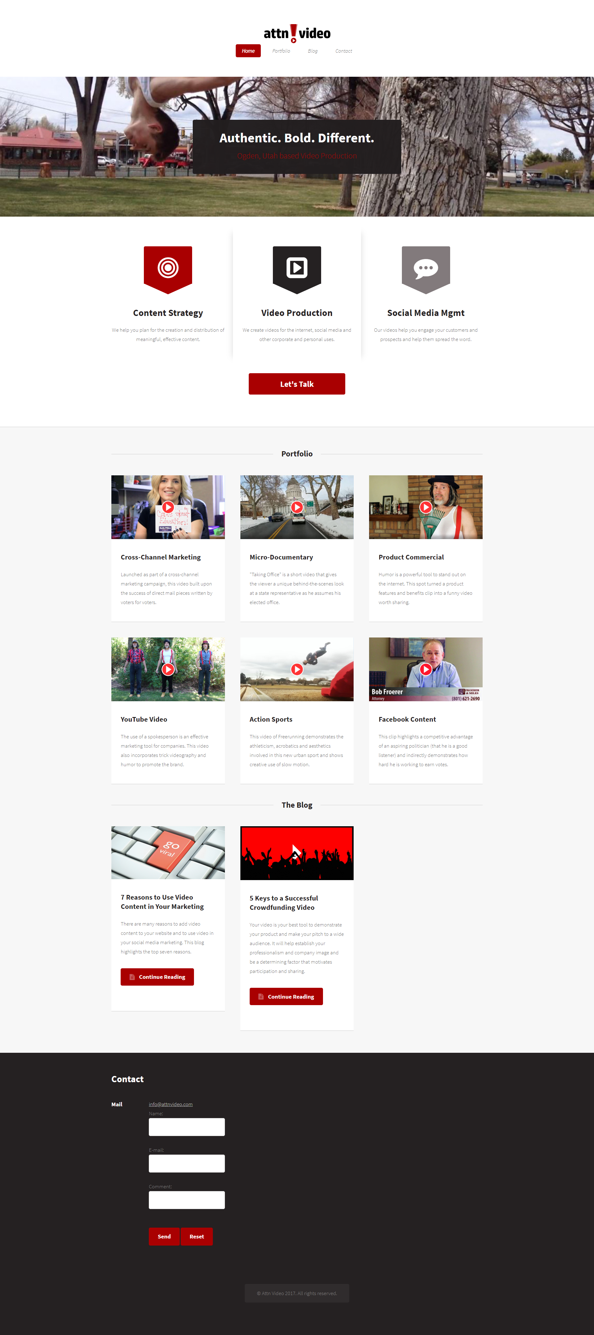
Attn Video is a video production company that creates promotional videos to boost business success. My boss asked me if I could redesign his old website so that it would be more appealing and retain responsiveness. He originally had his website all on a single page and asked that the redesign all be on a single page as well.
Old Home Page

To begin this project we had to gather information for the project and define our purpose. To do this we discussed who our target audience was. In this discussion we decided our target audience was all businesses and families in need of video production services in surrounding areas of northern Utah. We also discussed that the ultimate purpose of the website was to provide information about the services along with contact info for persons interested in the companies services. The last thing we had to decide on was if we were going to fix up the existing website or completely start over from scratch. Much of this was decided after researching our competitions websites and deciding what was most important for the site.
To start off my research I took some time by myself to look over the existing Attn Video website and pull from it things I liked, improvements I felt could be made, and any questions I could come up with concerning the site. I also researched many other video production websites as to gather more ideas. The following were some of my recommendations:
After reviewing it alone, I sat down with all the employees to discuss the needs of the current website. In this meeting I shared the information I found from my research. From the suggestions I had and those of my team, we decided the website should be created from scratch and we put together a list of items we felt would add value to the site both in function and overall appearance.
After compiling a list of items we wanted, I went to work designing a prototype that would incorporate all these items. Knowing one of the main requirements was to have the site all be on one page, I started by grouping my list items and creating my main sections for the page. I decided on four main sections which were Services, Portfolio, About Us, and Contact Us. After organizing my content into these groups I started working on the layout of each section. Once I had it roughly layed out I looked up the fonts I wanted to incorporate using Google Fonts. I also picked out my colors based off of what colors they were using on the old site, only adding one more color, giving us four colors total including our white. Now, because I was also coding this website, I began building the site along the way in order to make sure I could create what I had prototyped on certain aspects of the site. This was a great learning experience for me, as it gave me more insights as to what other options I had in creating my prototype. In designing the site to be responsive I began designing for mobile first and then incorporated the design in my tablet and desktop views as well. I understand this is best practice to ensure you get your most important content to display well for your users in a more refined space.
If this had been a bigger project or more time had been permitted, I would have followed my prototype design with other user research. User testing would have been important, ensuring our users could complete certain tasks while navigating the site. Since this was not the case, I just let my boss be the judge of the user experience on the site, since it was for his personal business.