The Computer Literacy Center at Weber State University approached me to redesign their existing website to better serve students across a wide age range and ability spectrum. The original site was cluttered, visually outdated, and difficult to navigate, especially for users with disabilities. My goal was to create a cleaner, more accessible experience while working within the constraints of the university’s CMS and design framework.
Problem Statement
The original Computer Literacy Center website presented students with dense, visually inconsistent pages that were difficult to scan and navigate. Key information, such as contact details and important dates, was buried or missing from high-traffic areas like the homepage. The design lacked clear visual hierarchy, making it challenging for users, especially those with disabilities or limited digital literacy, to find what they needed quickly. A redesign was needed to improve clarity, accessibility, and the overall user experience within the constraints of the university’s CMS.
Goals
Improve visual clarity and content organization
Ensure WCAG-compliant accessibility for all users
Enhance usability for a wide age range of students, including those with disabilities
Increase scanability so users can locate key information quickly and confidently
Work within CMS limitations while adding visual upgrades
Surface critical content (contact info, important dates) on the homepage
Work creatively within the constraints of WSU’s Site Manager and Foundation framework
Reduce content redundancy and streamline navigation
Research
As I began reviewing the existing website, I discovered that Weber State’s Site Manager and CKEditor were built on the Foundation framework, a system I was already familiar with. This gave me a head start in understanding the layout constraints and component options available within their CMS. I explored the framework’s building blocks to identify ways I could structure content more effectively while staying within technical limits. I also benchmarked similar university websites to see how they presented comparable information, which helped me balance usability with a touch of visual uniqueness. This foundational knowledge allowed me to work efficiently and creatively, even within a rigid system.
Design Strategy
Skipped wireframes due to timeline and project simplicity; moved directly into prototyping in Figma
Used Photoshop to create custom banners that added visual interest without breaking CMS limitations
Reorganized page content for better scannability and reduced cognitive load
Converted key links into buttons to improve visibility and clickability
Added prominent contact info and important dates to the homepage for quick access
Structured headings and semantic layout to support screen readers
Verified color contrast using WebAIM’s Color Contrast Checker to ensure readability for users with low vision or color blindness
Impact
Enhanced usability for a diverse student population
Improved accessibility compliance, reducing legal risk for the university
Streamlined content presentation, making the site easier to maintain and navigate
Delivered a more welcoming and professional digital presence for the Computer Literacy Center
Before and After
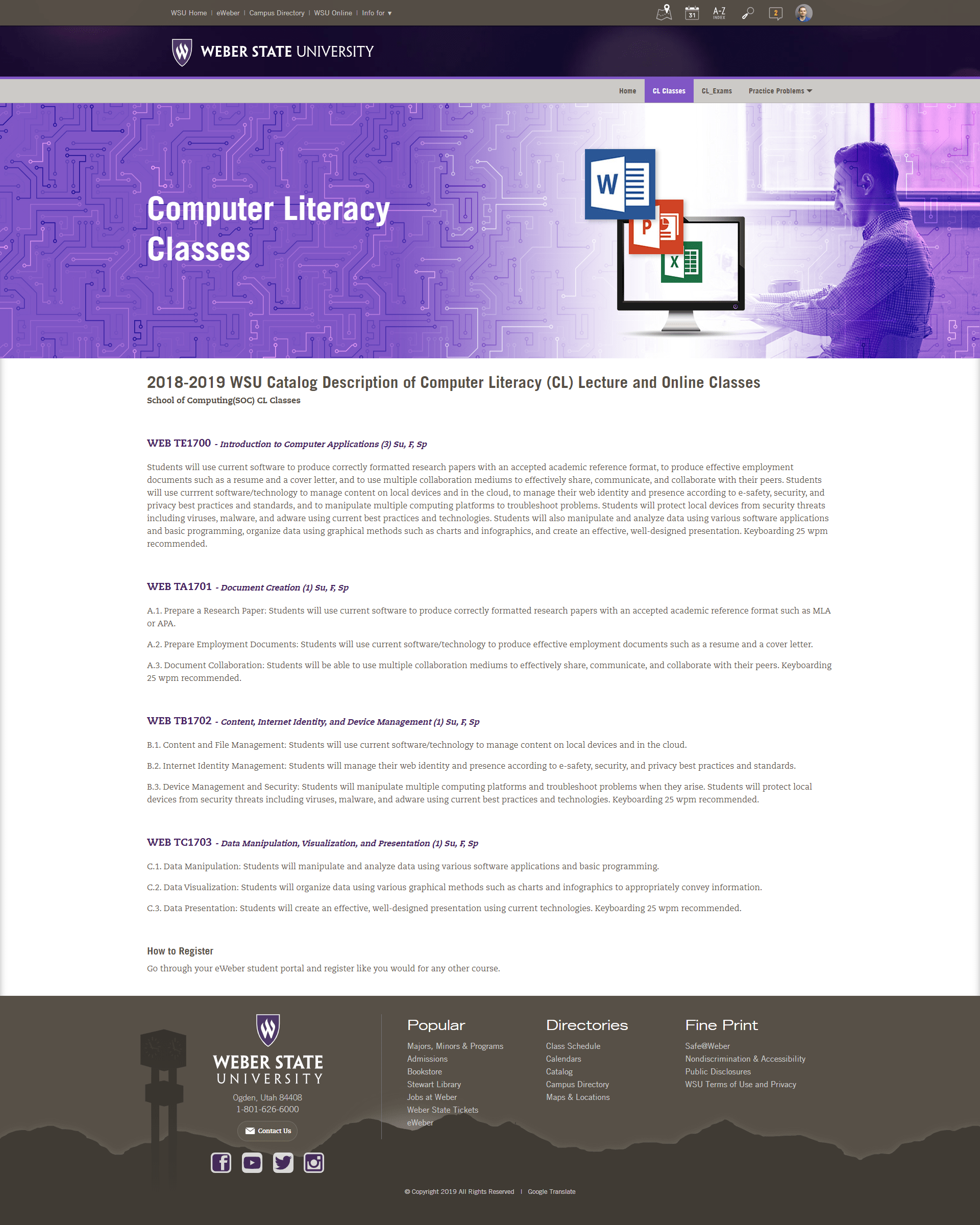
Home Page
Before
After
Key Improvements:
Surfaced Key Information like contact details, and important dates and other important information
Improved visual hierarchy for easier scannability and created clear sections
Structured headings semantically for screen reader compatibility
Reduced visual clutter to help users scan content more easily
Designed custom banner in Photoshop to give the page a unique, welcoming feel
Classes Page
Before
After
Key Improvements:
Improved visual hierarchy for easier scannability and created clear sections
Structured headings semantically for screen reader compatibility
Reduced visual clutter to help users scan content more easily
Designed custom banner in Photoshop to give the page a unique, welcoming feel
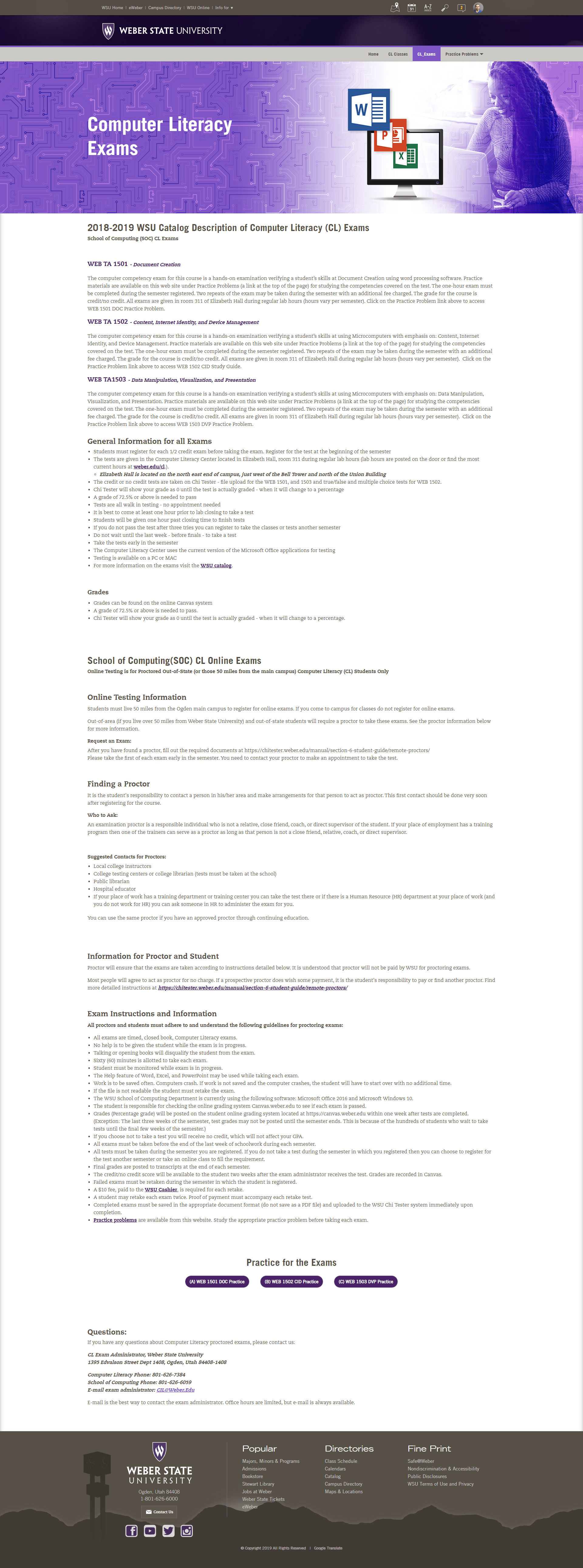
Exams Page
Before
After
Key Improvements:
Organized content into clear sections with better visual flow, making it easier for users to scan and find what they need.
Made practice exams easier to find by turning buried links into clearly labeled buttons.
Structured headings semantically for screen reader compatibility
Designed custom banner in Photoshop to give the page a unique, welcoming feel
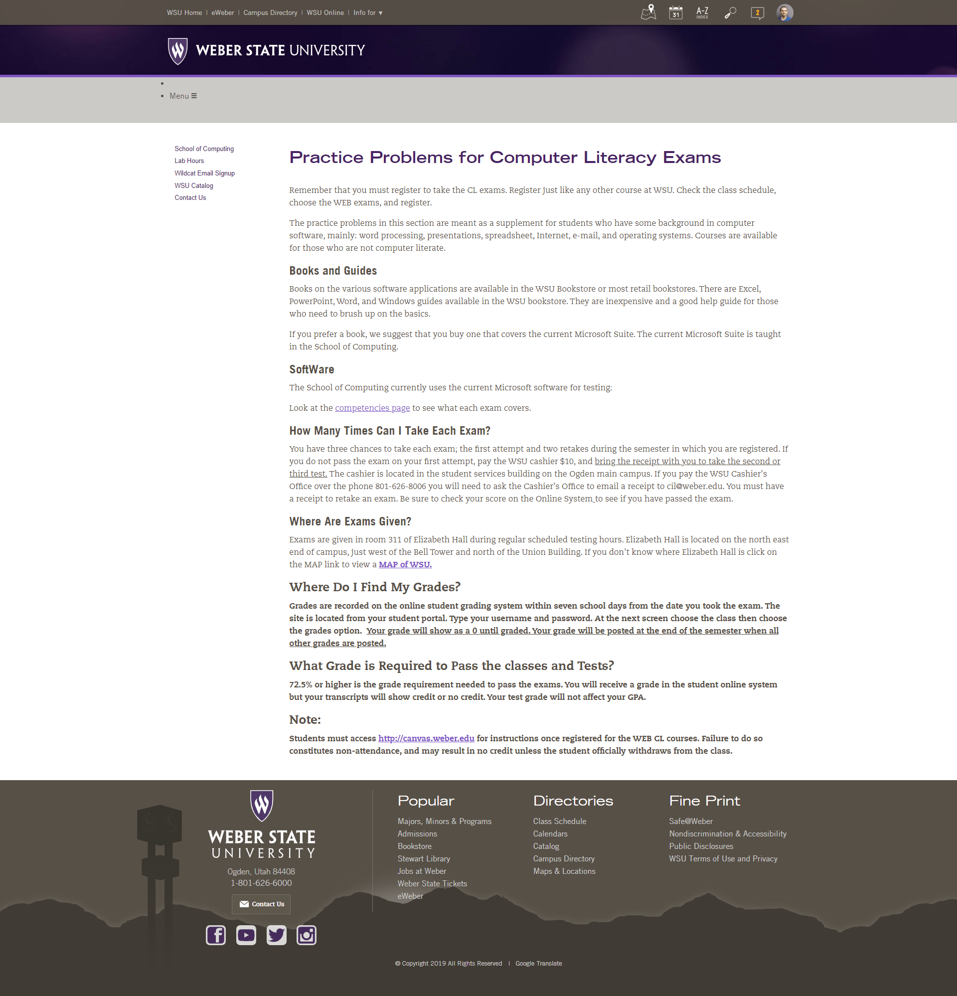
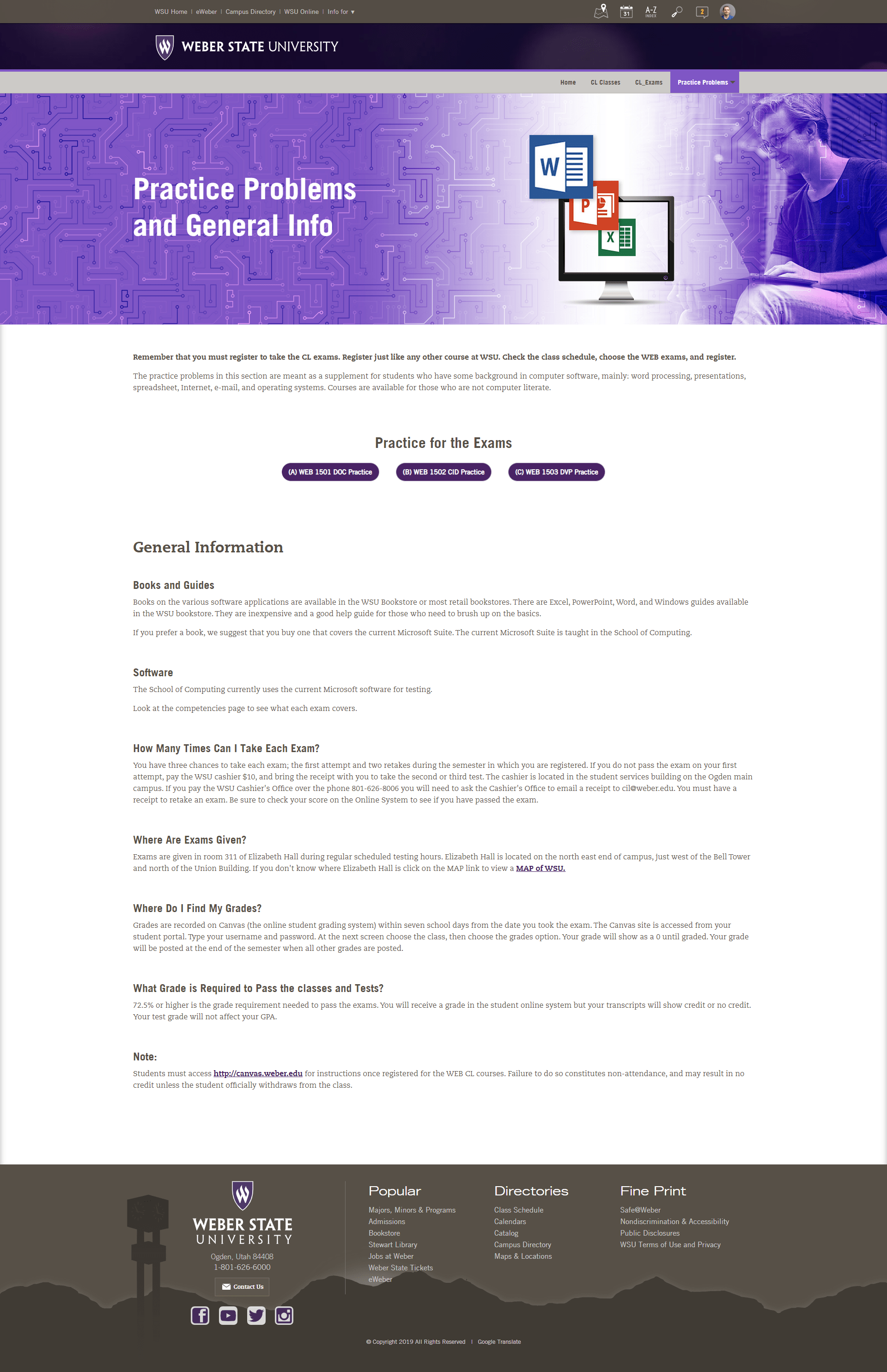
Practice Problems and General Info
Before
After
Key Improvements:
Organized content into clear sections with better visual flow, making it easier for users to scan and find what they need.
Made practice exams easier to find by turning buried links into clearly labeled buttons.
Structured headings semantically for screen reader compatibility
Designed custom banner in Photoshop to give the page a unique, welcoming feel
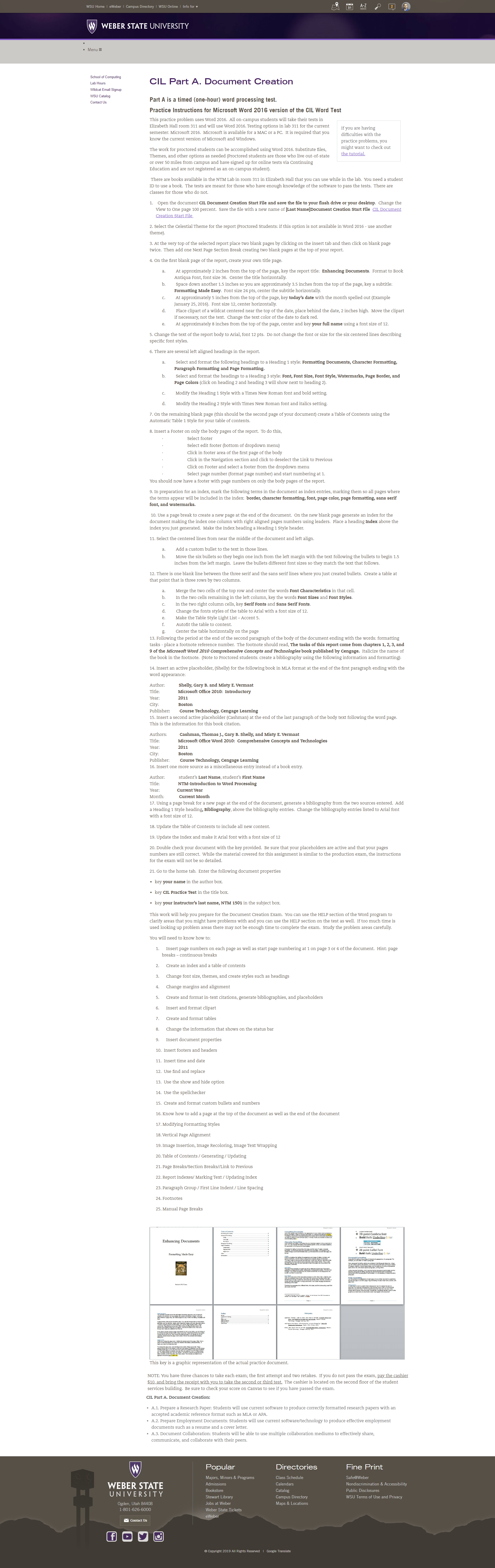
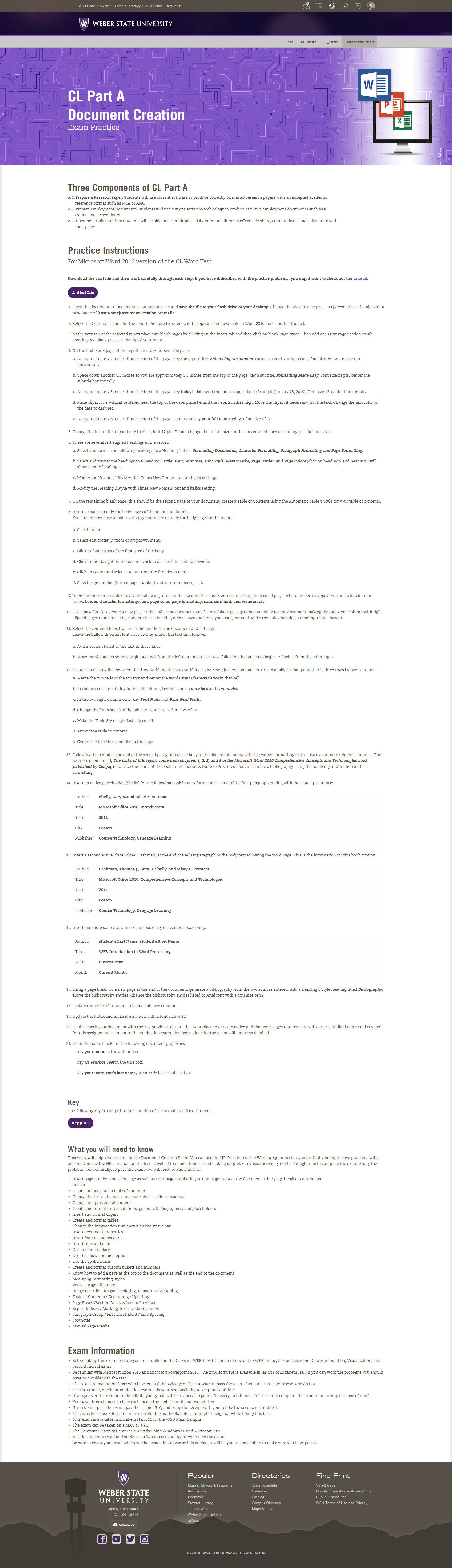
Computer Literacy Document Creation
Part A
Before
After
Key Improvements:
Organized content into clear sections with better visual flow, making it easier for users to scan and find what they need.
Made practice exams easier to find by turning buried links into clearly labeled buttons.
Structured headings semantically for screen reader compatibility
Designed custom banner in Photoshop to give the page a unique, welcoming feel
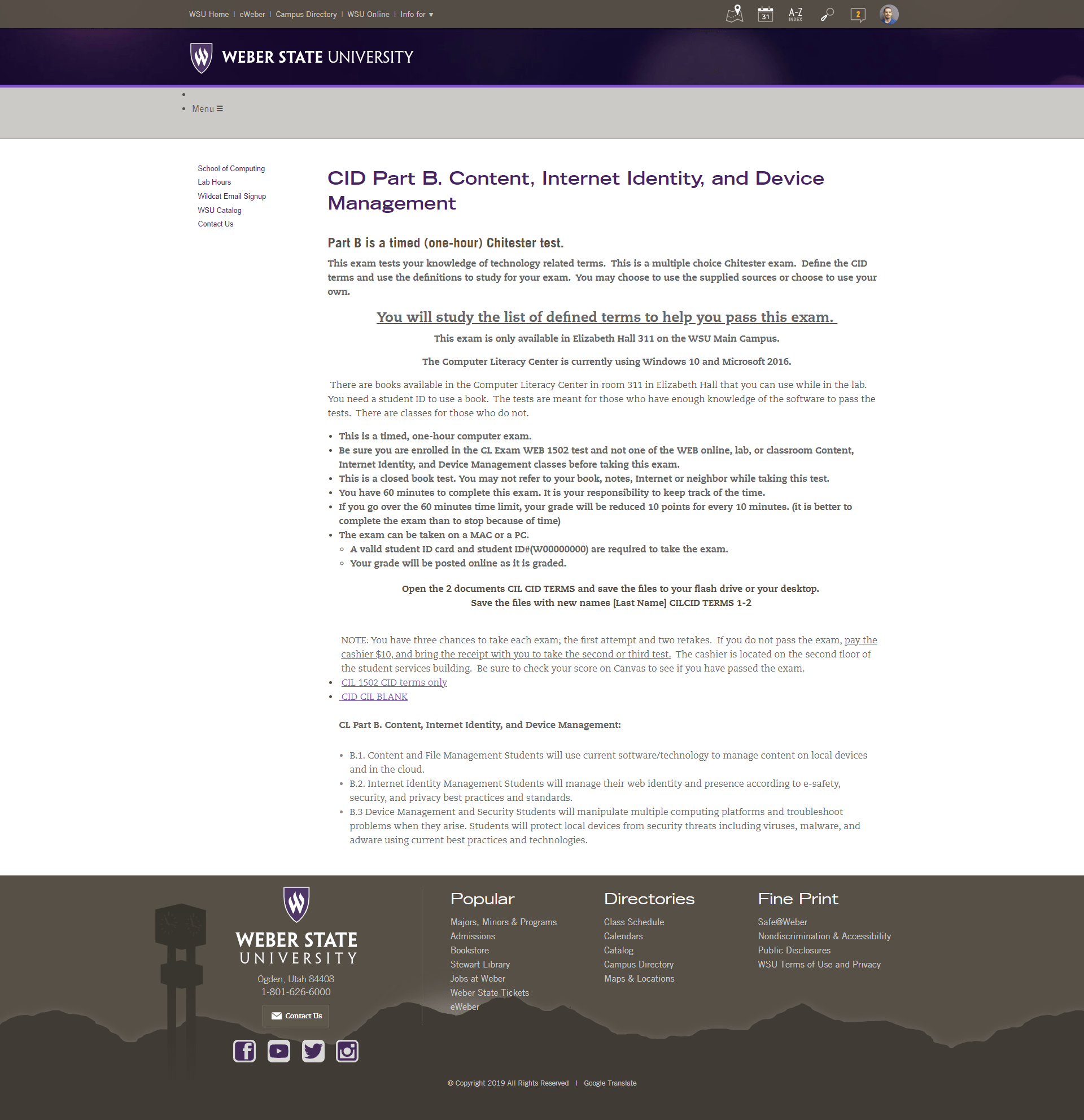
Computer Literacy Document Creation
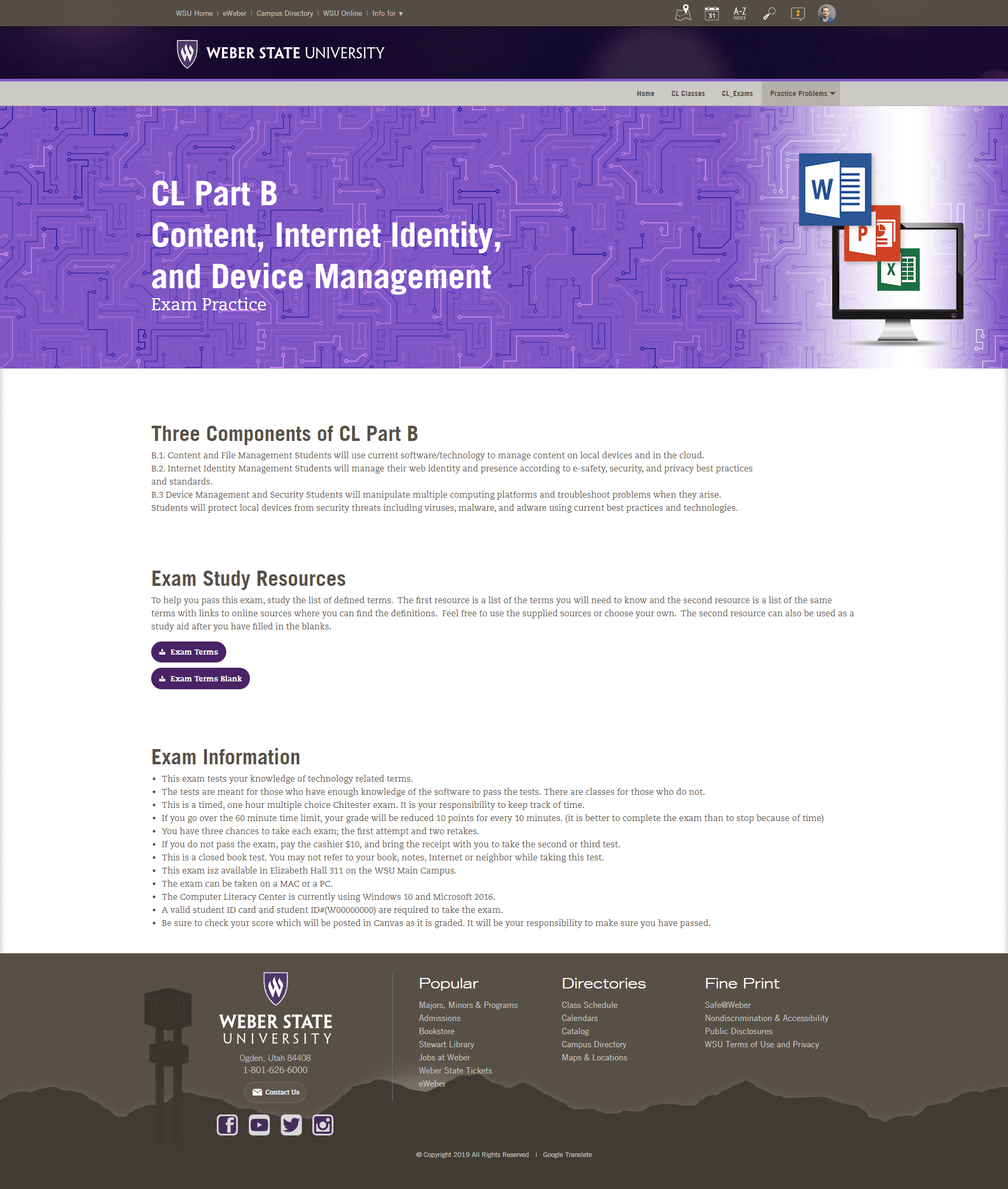
Part B
Before
After
Add Content
Add Content
Add Content
Computer Literacy Document Creation
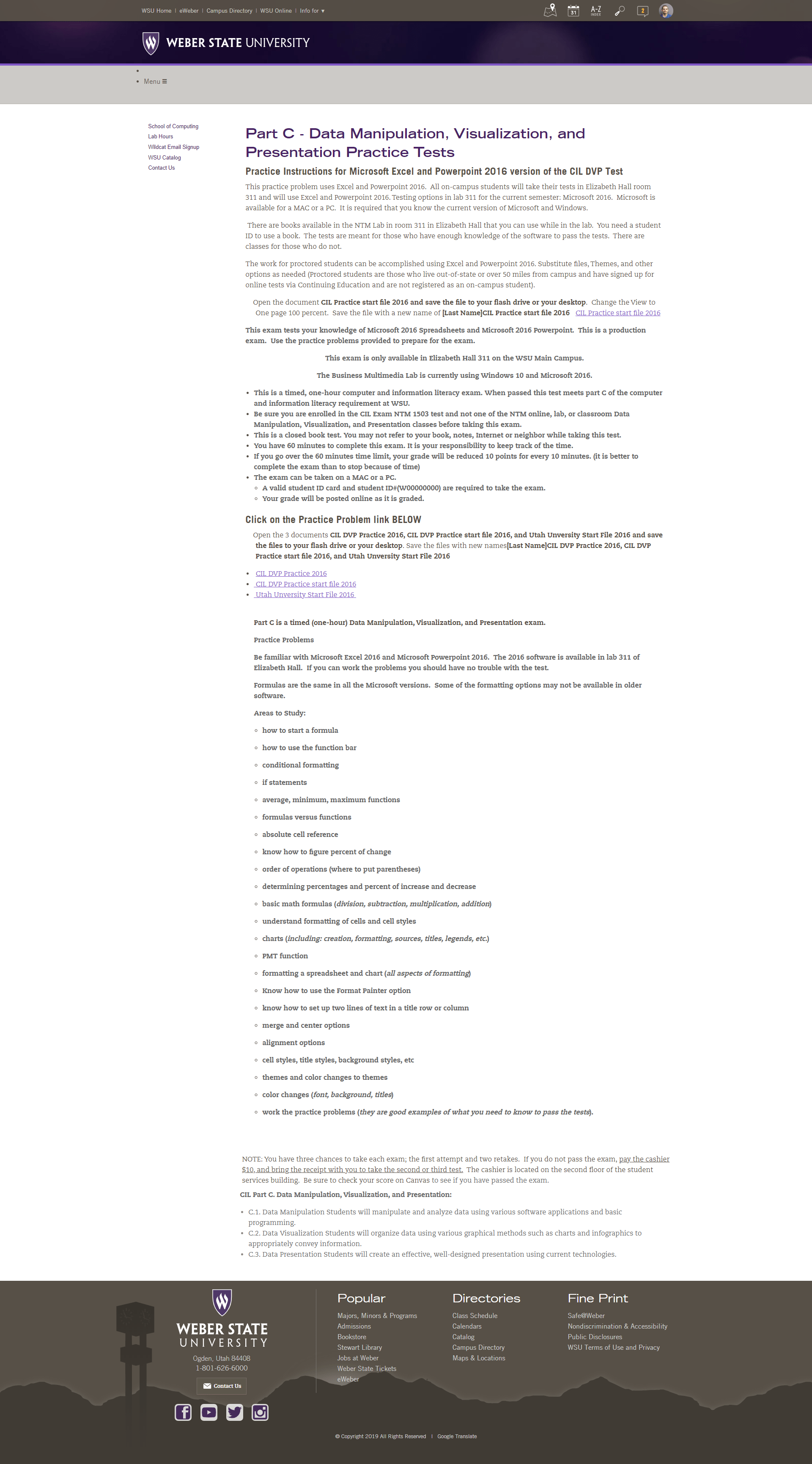
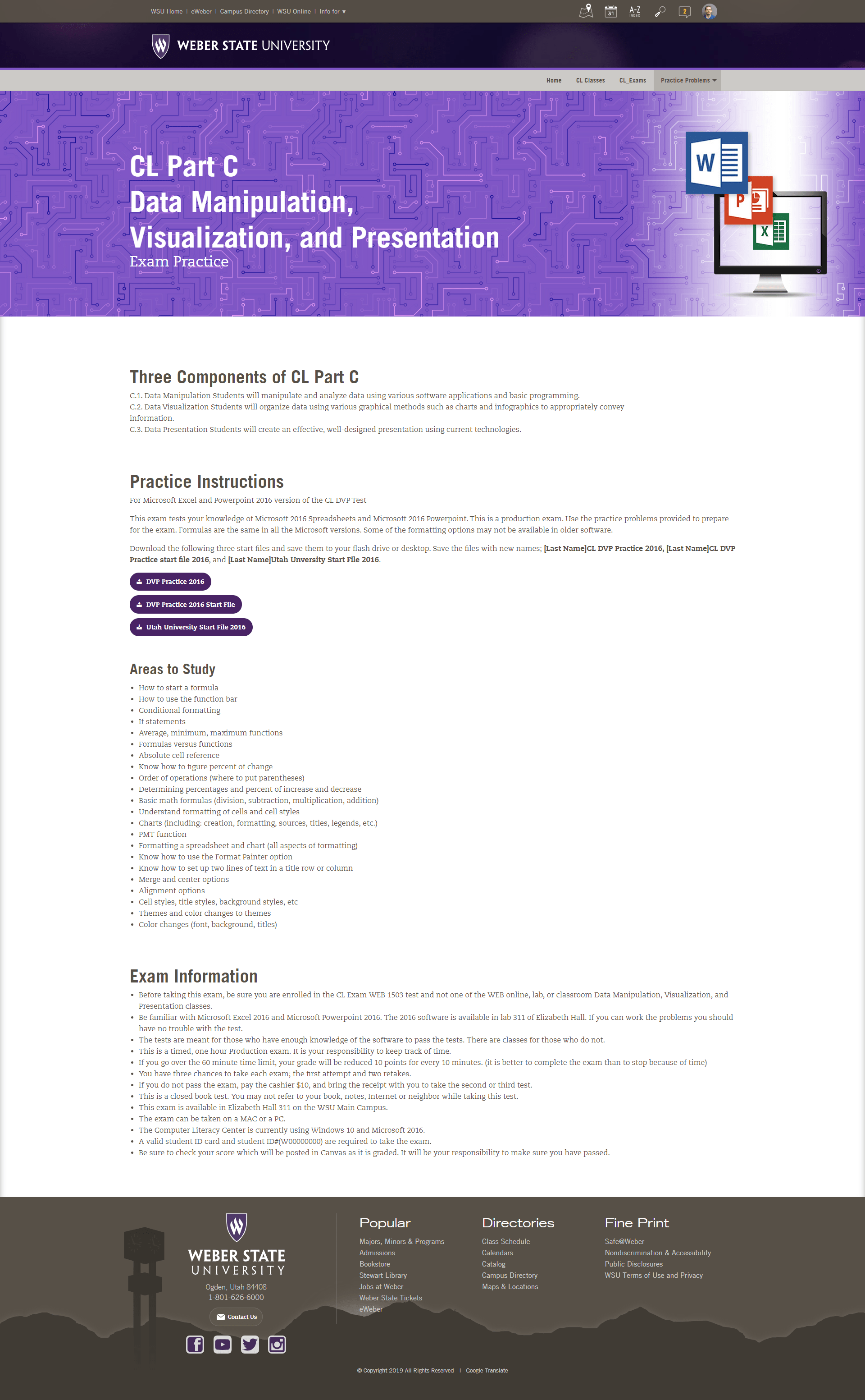
Part C
Before
After
Add Content
Add Content
Add Content
What I Learned
This project reinforced the importance of designing with clarity and accessibility at the forefront, especially when working within rigid systems like a university CMS. I learned how to leverage my familiarity with the Foundation framework to navigate technical constraints creatively, and how small layout decisions, like surfacing contact info or simplifying navigation, can dramatically improve usability for a diverse audience. It also deepened my appreciation for designing with empathy, ensuring that users of all ages and abilities can confidently engage with the content.