Wallboard Performance Alerts
Company: Clearview
Role: UX Designer
Company: Clearview
Role: UX Designer
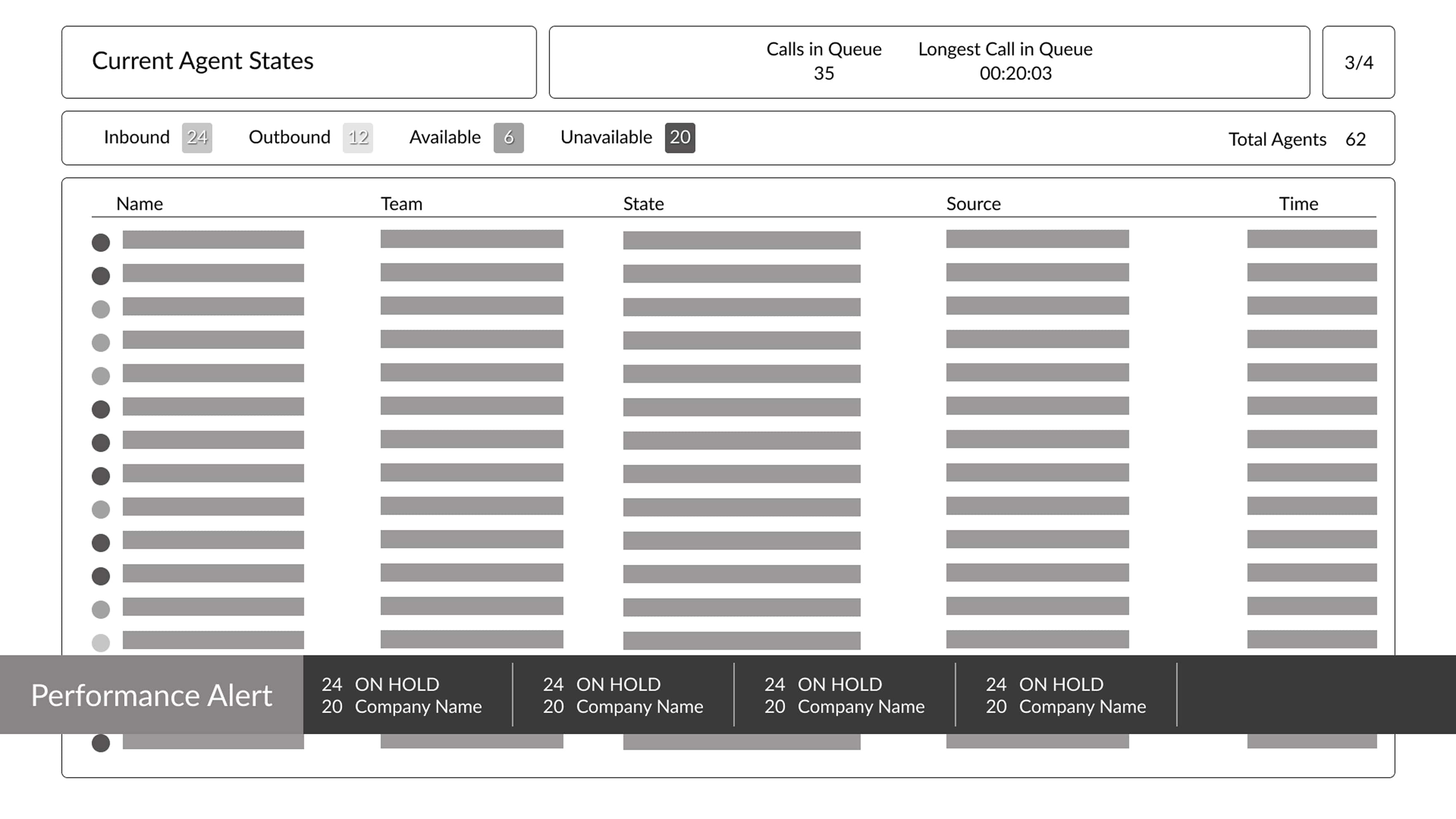
Call centers rely on wallboards to display rotating performance metrics and other info across teams. These wallboards are designed for passive monitoring, but lacked a mechanism to proactively flag critical issues in real time.

Call centers currently lack a proactive way to highlight performance metrics that fall below critical thresholds. Without real-time visual alerts, teams may miss opportunities to intervene before issues escalate. Introducing a threshold-based alert feature on wallboards would ensure that key metrics demanding attention remain visible until they recover, empowering faster response times and improved operational awareness.
Key Design Decisions:
This solution didn’t just solve a visibility problem, it reshaped the operational rhythm of the call center, turning passive monitoring into proactive action.
Pros
Cons
Pros
Cons
Choosing an overlay for performance alerts significantly improved visibility and ensured the alert data remained distinct from the dynamic content on the wallboard slides. Since the slides continuously rotate through different views, placing alerts at the bottom of each slide would make them feel embedded in the slide itself, requiring individual modifications across all slides. This approach would increase development time and reduce ROI, whereas the overlay allows for a centralized, reusable alert system that’s both efficient and scalable.
Leading UI checks taught me the value of proactive design governance. By mentoring teammates and refining our system collaboratively, I saw firsthand how a well-defined design system can empower creativity while maintaining consistency. It also sharpened my ability to balance flexibility with structure, ensuring our components served both individual project needs and broader organizational goals.