Slide-Out Settings for Wallboards
Company: Clearview
Role: UX Designer
Company: Clearview
Role: UX Designer
As part of a system-wide UX overhaul, I led the redesign of the settings architecture for wallboard slides and custom widgets. Previously, these settings were presented in modal steppers, linear, interruptive, and difficult to scale. My challenge was to migrate these into a new slide-out panel framework that supports modular sections, improves discoverability, and aligns with our evolving design system.
Our design system recently introduced a new slide-out settings framework for dashboard configurations, anchored to the right side of the screen, modular, and context-preserving. While this solved major usability issues in dashboard workflows, our wallboards still relied on modal steppers for configuring slide types and custom widgets. These modals were linear, interruptive, and inconsistent, making it difficult for users to navigate. My challenge was to adapt and extend the new slide-out framework to the wallboards ecosystem, transforming a fragmented experience into a unified, scalable architecture. This involved reworking settings for every wallboard slide type and custom widget, modularizing their configuration flows, and aligning them with our evolving design standards, all while preserving flexibility and clarity for users managing complex display logic.
Slide Types Settings Refactored
Custom Slide Widget Settings Refactored
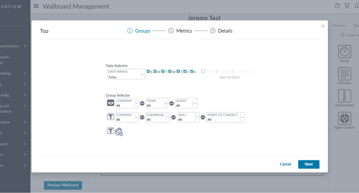
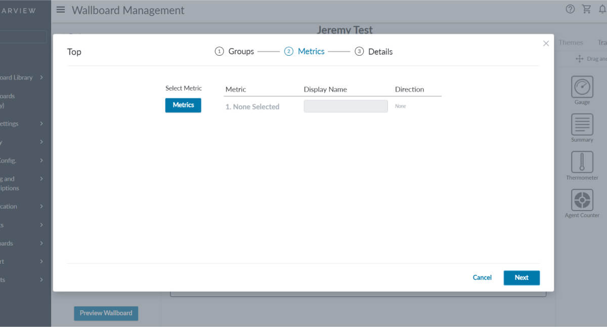
Before (Modal)
After (Slideout)
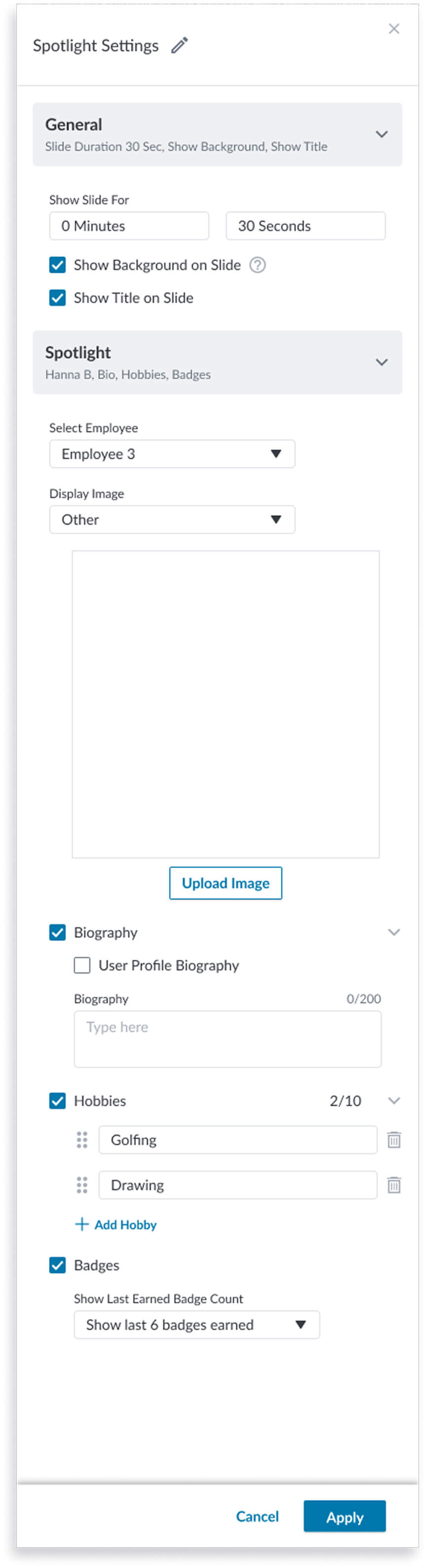
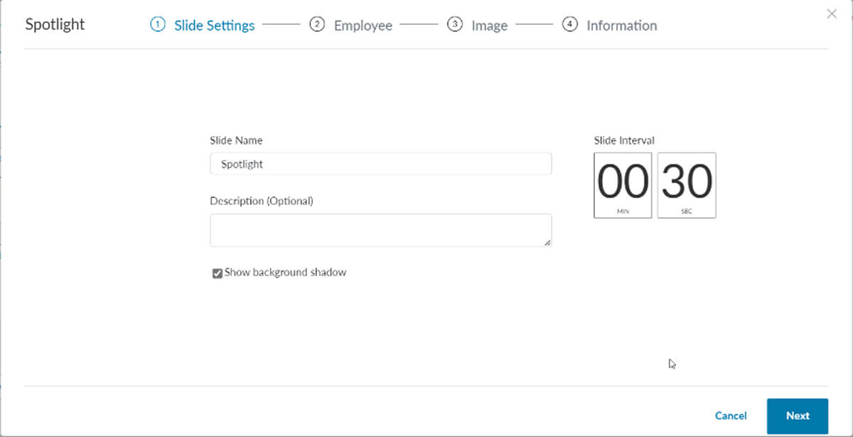
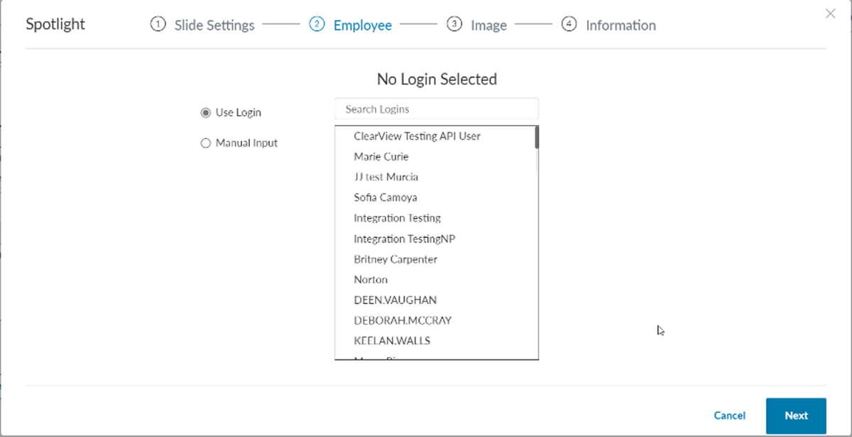
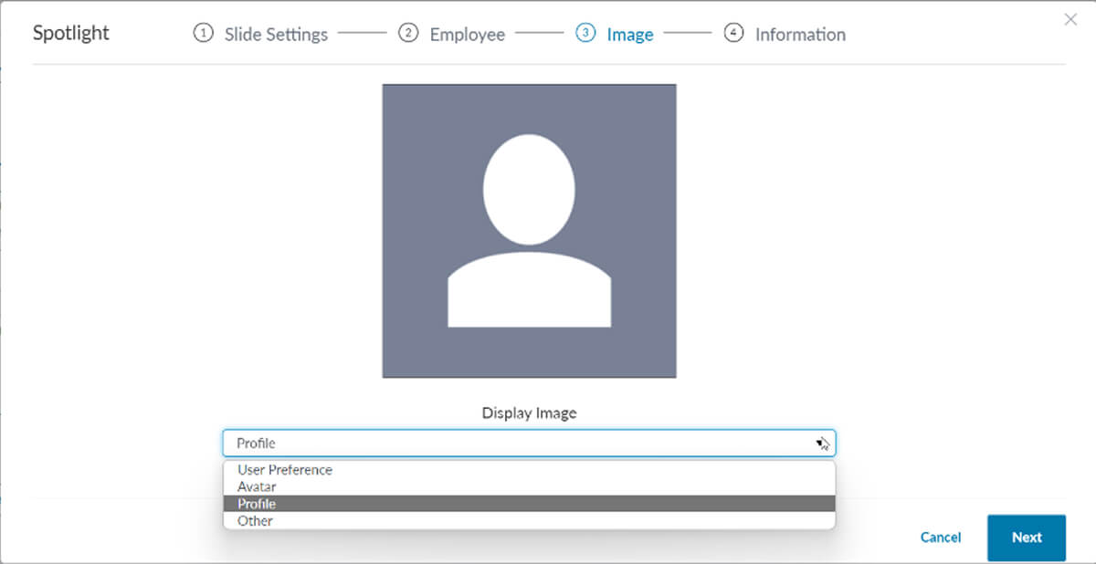
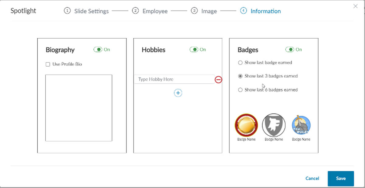
The spotlight settings remake was full of a lot of opportunity to improve some functions while adapting it to a new framework. Here are some of the changes that helped improve the usability of the design:
Before (Modal)
After (Slideout)
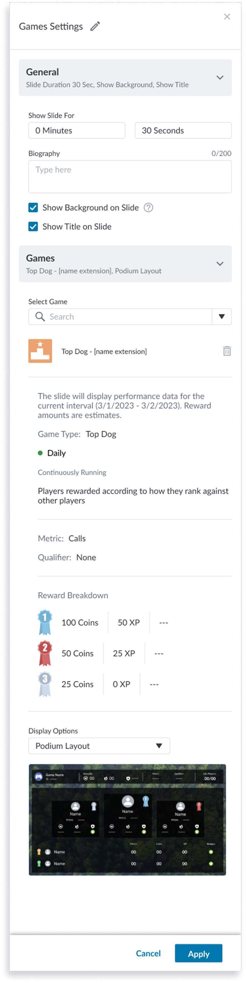
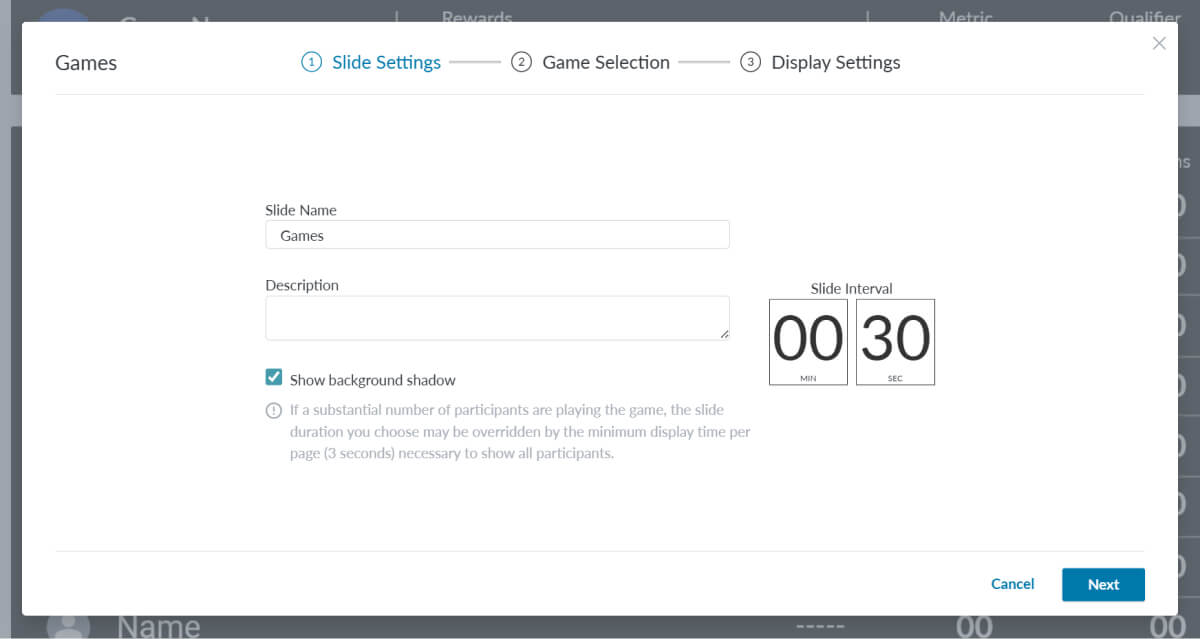
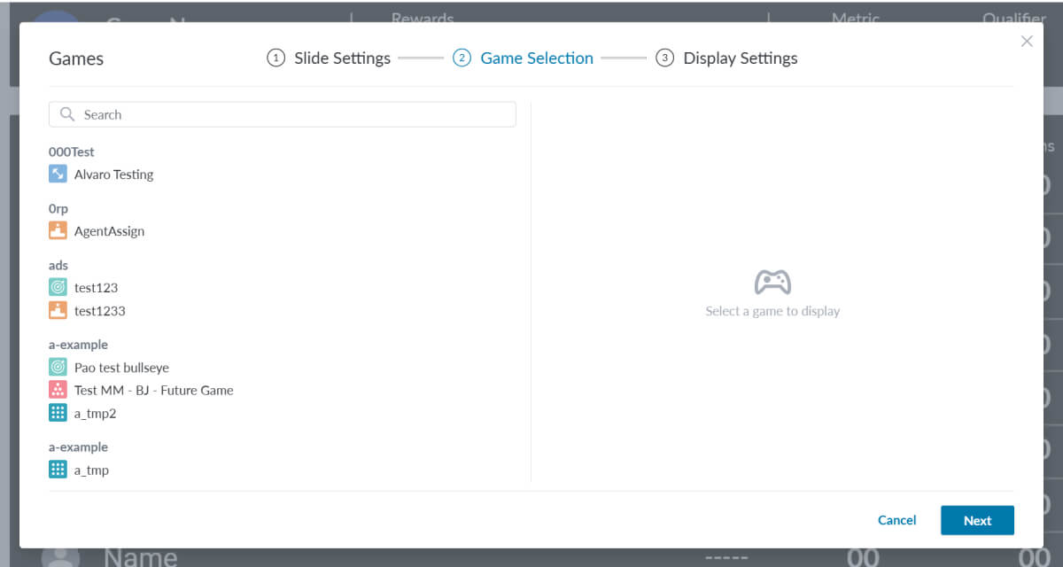
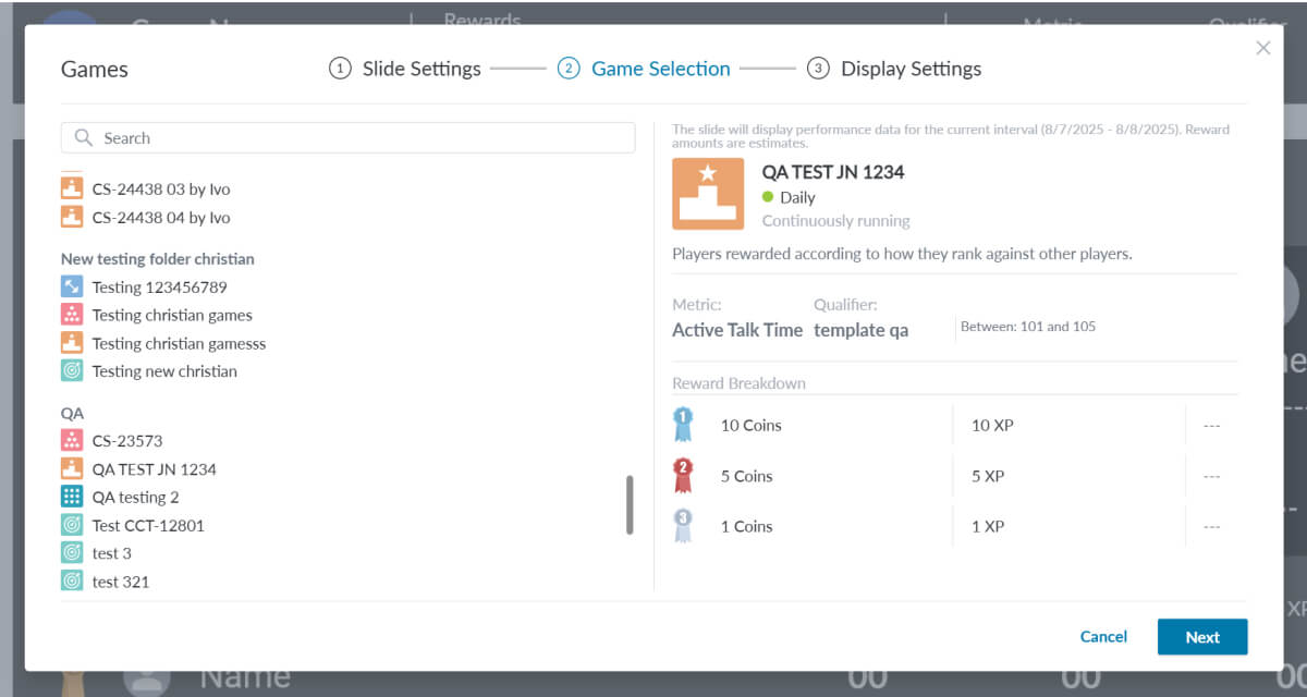
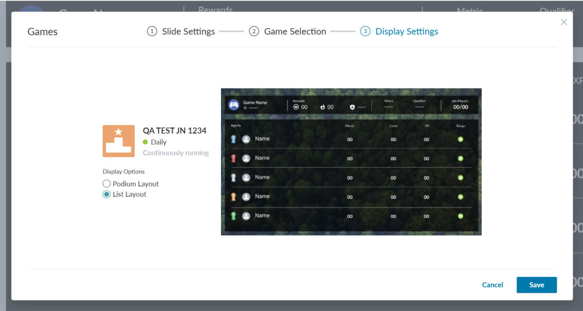
The Games settings slideout settings adaption was a bit more complex but also full of opportunity to improve usability. Although I don’t show all instances of the settings in my examples, I can highlight some of the improvements made here:
Before (Modal)
After (Slideout)
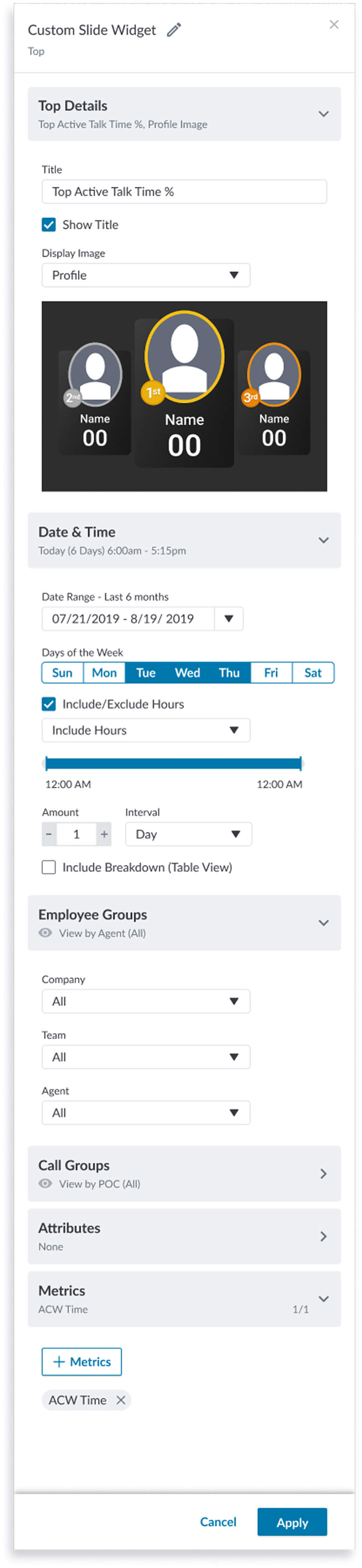
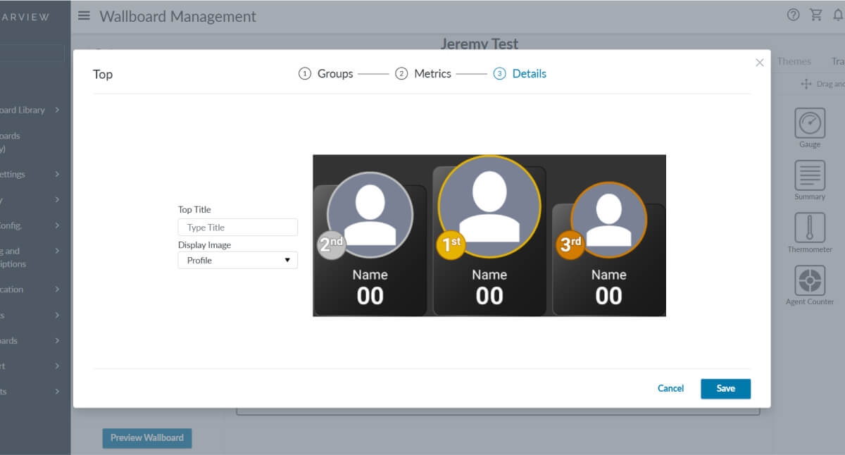
The Custom Slide options were only slightly different from the other slide types, in that they had a subheading at the top indicating the widget type that is included on the custom slide. For the Top widget, which displays agents in top positions for specific metrics I have the following highlights I would like to mention:
This project deepened my expertise in scaling design system patterns across diverse contexts, particularly by adapting the slide-out settings framework to wallboards. While responsiveness wasn’t a core requirement, the constraints and layout challenges naturally highlighted my ability to think responsively, designing components that flex across screen sizes and configurations without compromising clarity or usability. I learned how to audit legacy flows, modularize UI elements, and build scalable systems that balance consistency with contextual nuance.