Release Modal
Company: Clearview
Role: UI Lead
Company: Clearview
Role: UI Lead
I supported a UX designer as the UI lead on a redesign of the Clearview Release Modal. The goal was to make new features easier to find and more visually engaging. His initial design was approved, but the project later resurfaced when the product manager raised concerns about missing details in the first view,something I had mentioned earlier. The designer revised the layout using examples I had shared, and I was invited to explore the design myself. My proposal refined the hierarchy and clarity, and ultimately became the final version.
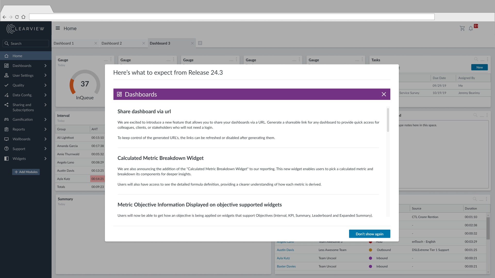
The current Release Modal on the Clearview Platform presents updates in a collapsible, single-view format. While this works for short content, it becomes hard to read and navigate when release details grow longer.
Key Issues:
Must-Have Goals
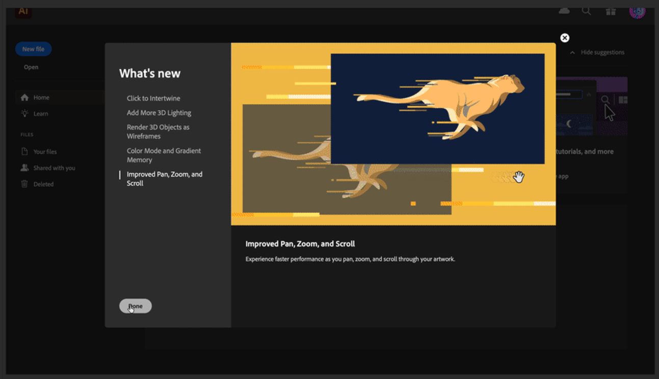
To support the redesign, I explored how other platforms surface product updates, including Adobe’s approach to highlighting new features with visuals and structured summaries. These examples helped inform early conversations and later revisions. I also flagged the importance of showing prominent features upfront, which became a key concern raised by the product manager after the initial design was approved.
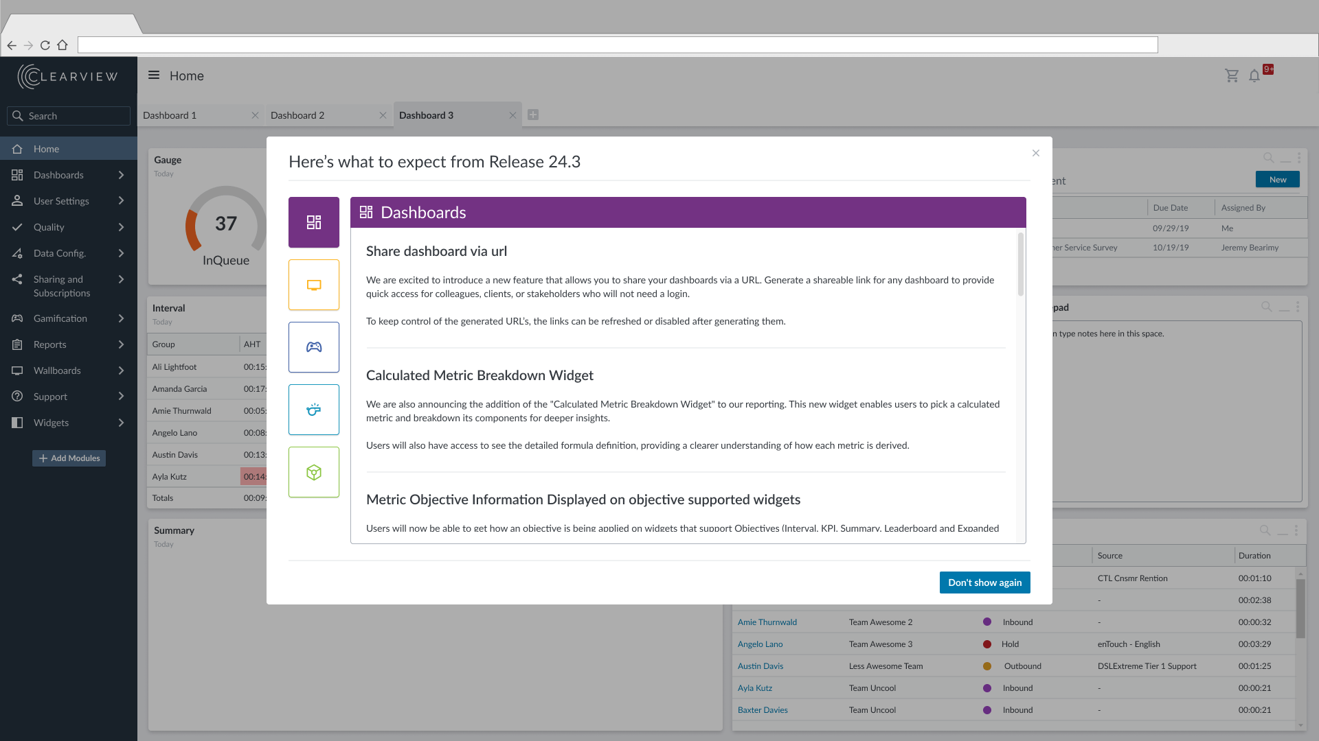
I liked the way that this can intially load with details on your most prominent feature and provides you different options for navigating through all the releases.


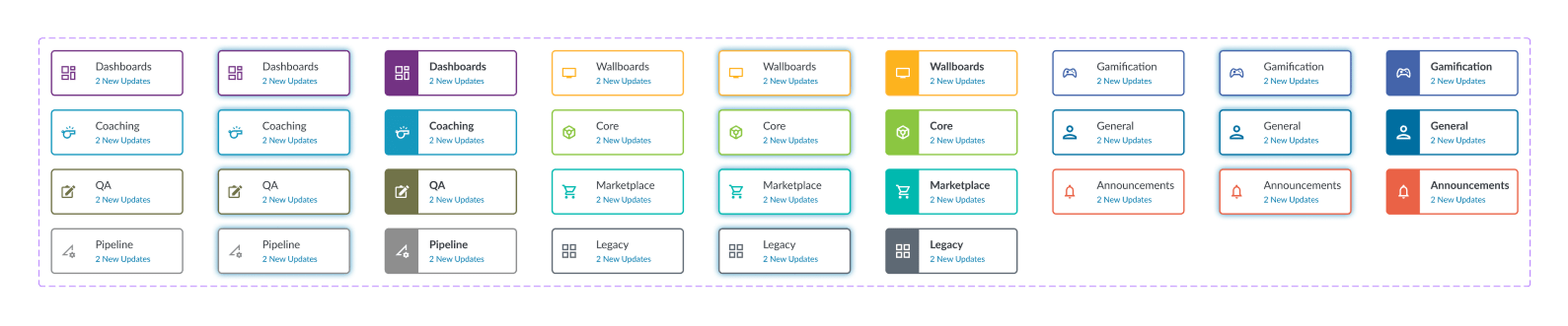
These are some wireframes I created when I came in to support my teammate on there project. The images above show two different iterations.

This design was intended to work by clicking on one of the categories cards, which would then open up the list of new or updated features for that category. To get back to the menu they would click on the close icon.
My teammate created this design after it was resurfaced by the product manager. This design got it closer to what I had in mind with the detail on the same view as the category cards.
This project reminded me how easily early design decisions can shape long-term outcomes. By stepping in after the initial approval, I saw how overlooked details can surface later and shift the direction of a project. Collaborating with a teammate gave me space to support and challenge ideas without making him feel like I was overhauling his project. It also showed me how visual hierarchy and layout clarity can directly influence how users engage with new features. The final design wasn’t just cleaner, it was more aligned with what users actually needed.
