Unifying Challenge Widget Game Settings
Company: Clearview
Role: UI Lead
Company: Clearview
Role: UI Lead
As the UI Lead, I stepped in to support fellow designers working on a dashboard widget featuring three mini-games. My primary objective was to unify the layout and styling of the settings across all games, ensuring consistency, clarity, and scalability within the broader design system.


Each game had its own settings interface, developed independently. This led to:
The challenge was to streamline these interfaces into a cohesive experience while preserving each game's unique functionality.
To unify the settings UI, I focused on:
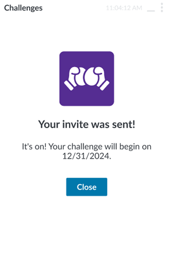
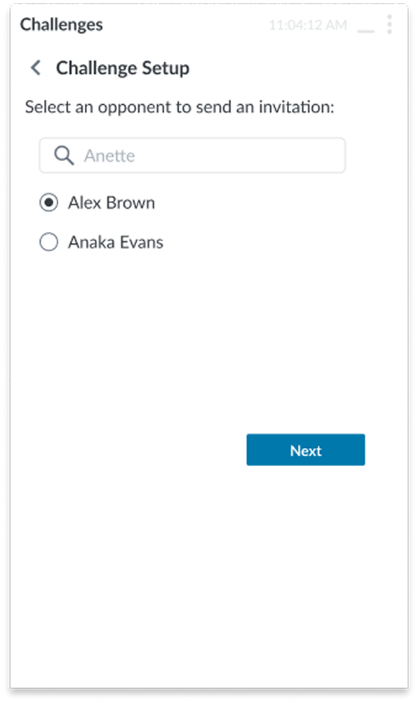
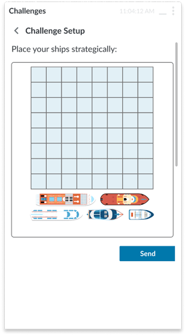
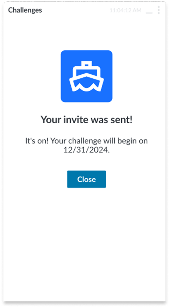
Before

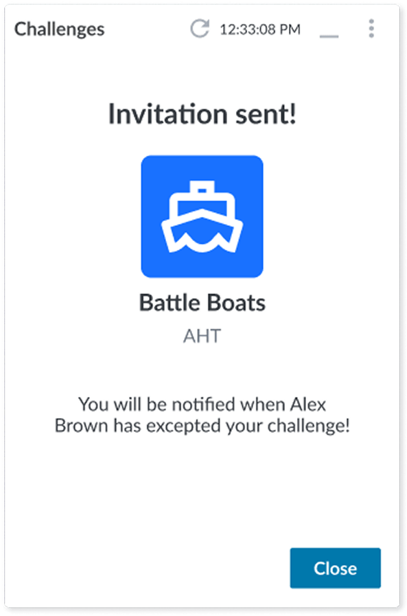
After
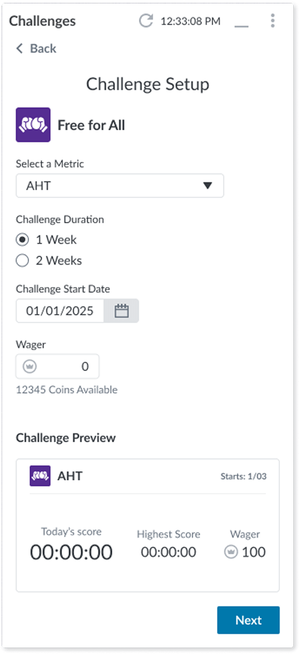
Changes:
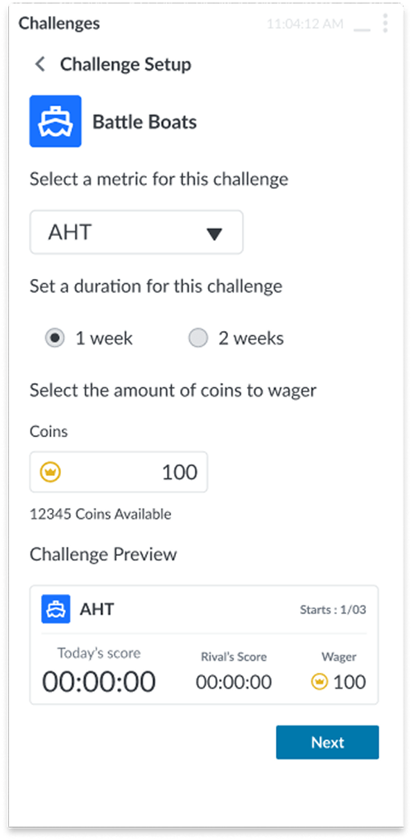
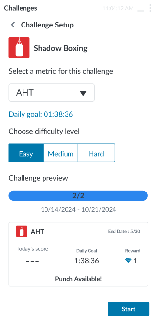
Before
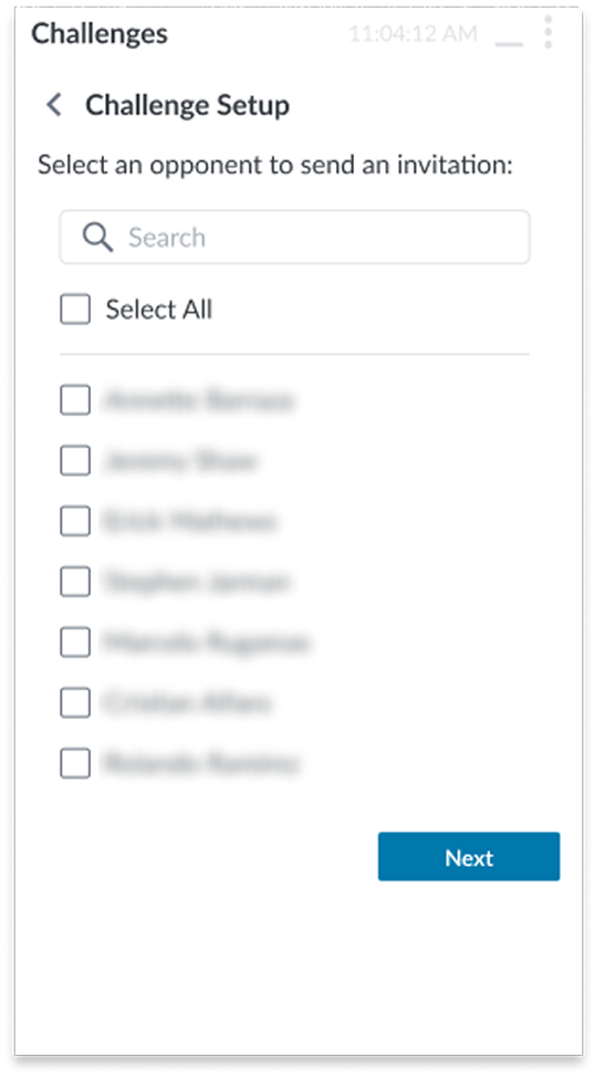
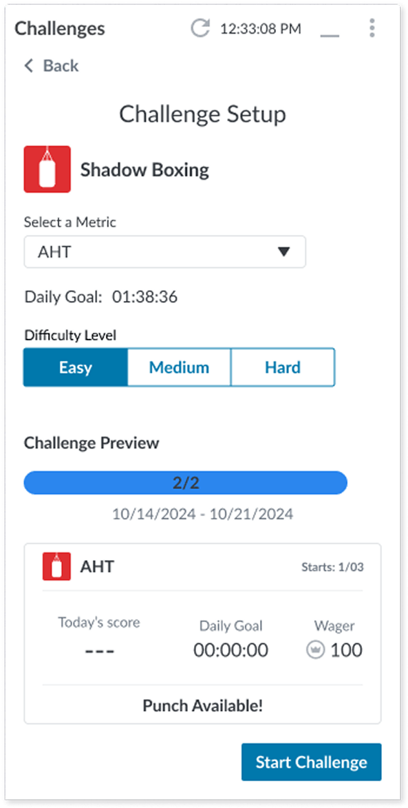
After
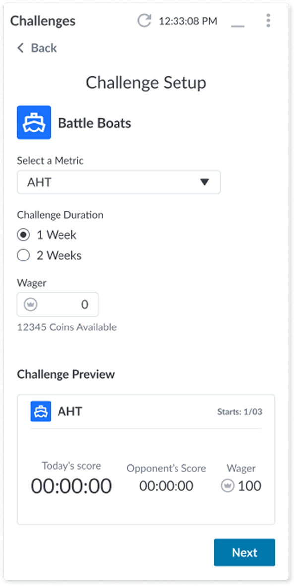
Changes:
NOTE: Names were blurred for privacy since I initially designed them with the names of coworkers.
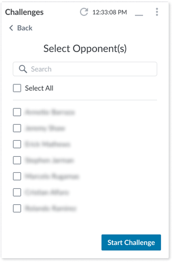
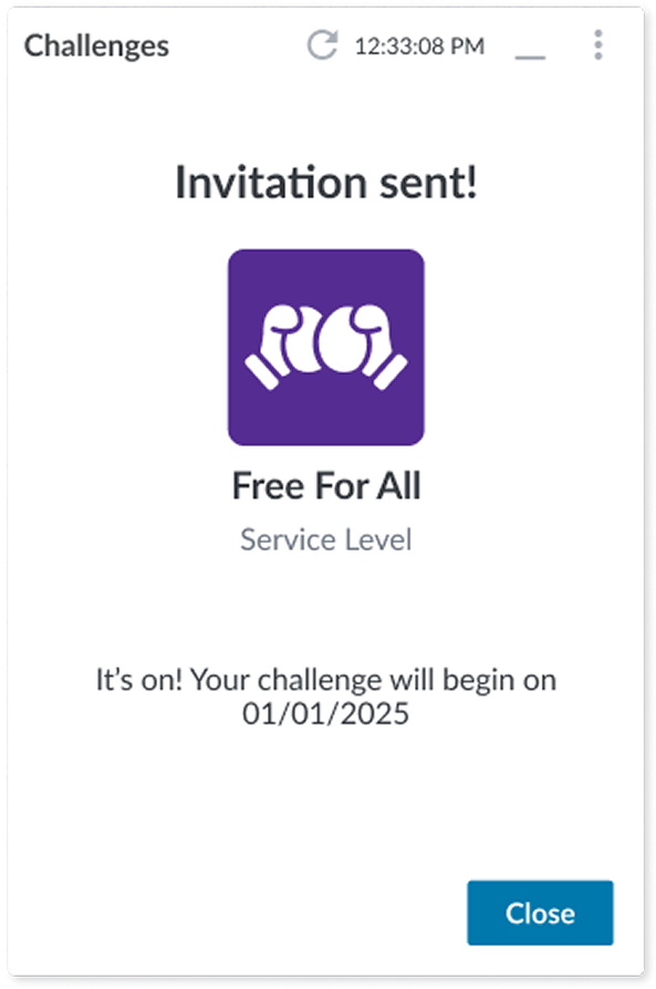
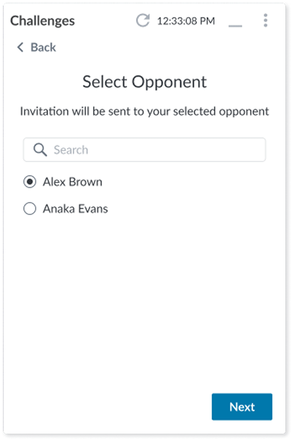
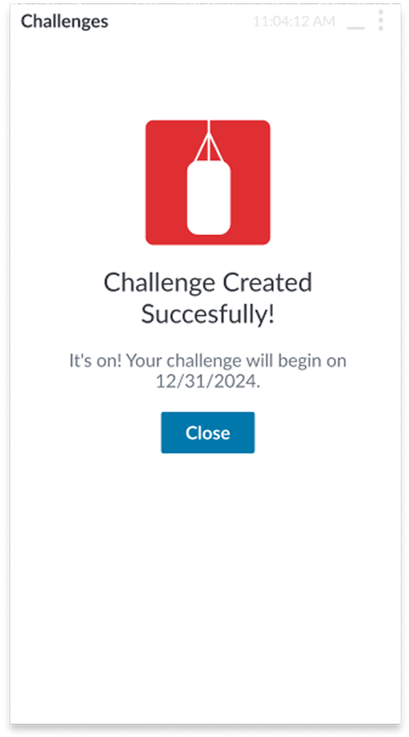
After
To help prevent the user from making a mistake, I added a summary screen where they can review what they set up before sending out the challenge invites.
NOTE: Names were blurred for privacy since I initially designed them with the names of coworkers.
Before
After
Changes:
Before
After
Changes:
Before
After
Changes:
Before
After

Changes:
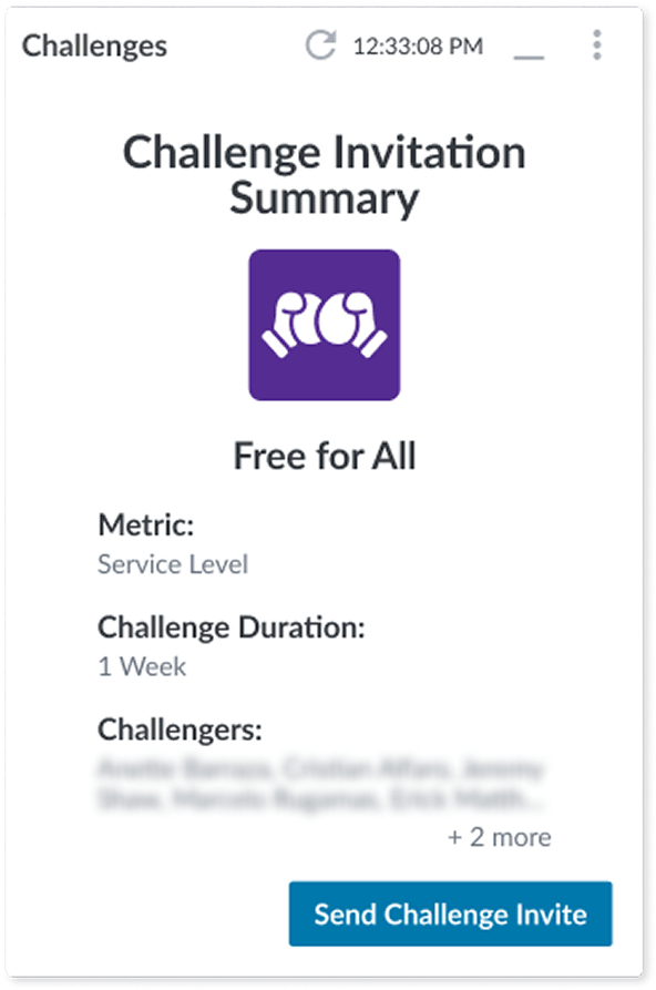
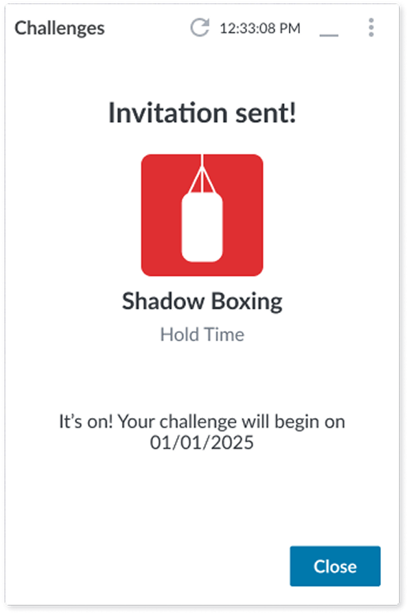
After
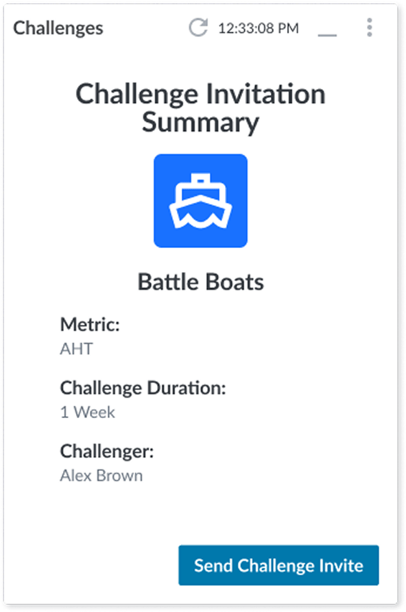
To help prevent the user from making a mistake, I added a summary screen where they can review what they set up before sending out the challenge invites.
Before
After
Changes:
Before
After
Changes:
Before
After
Changes:
By guiding other designers through the nuances of tokens, variants, and layout logic, I saw firsthand how shared understanding can unlock consistency and creativity. It wasn’t just about building components, it was about building confidence in the system itself. That shift in mindset across the team was just as rewarding as the final product.